Flourish
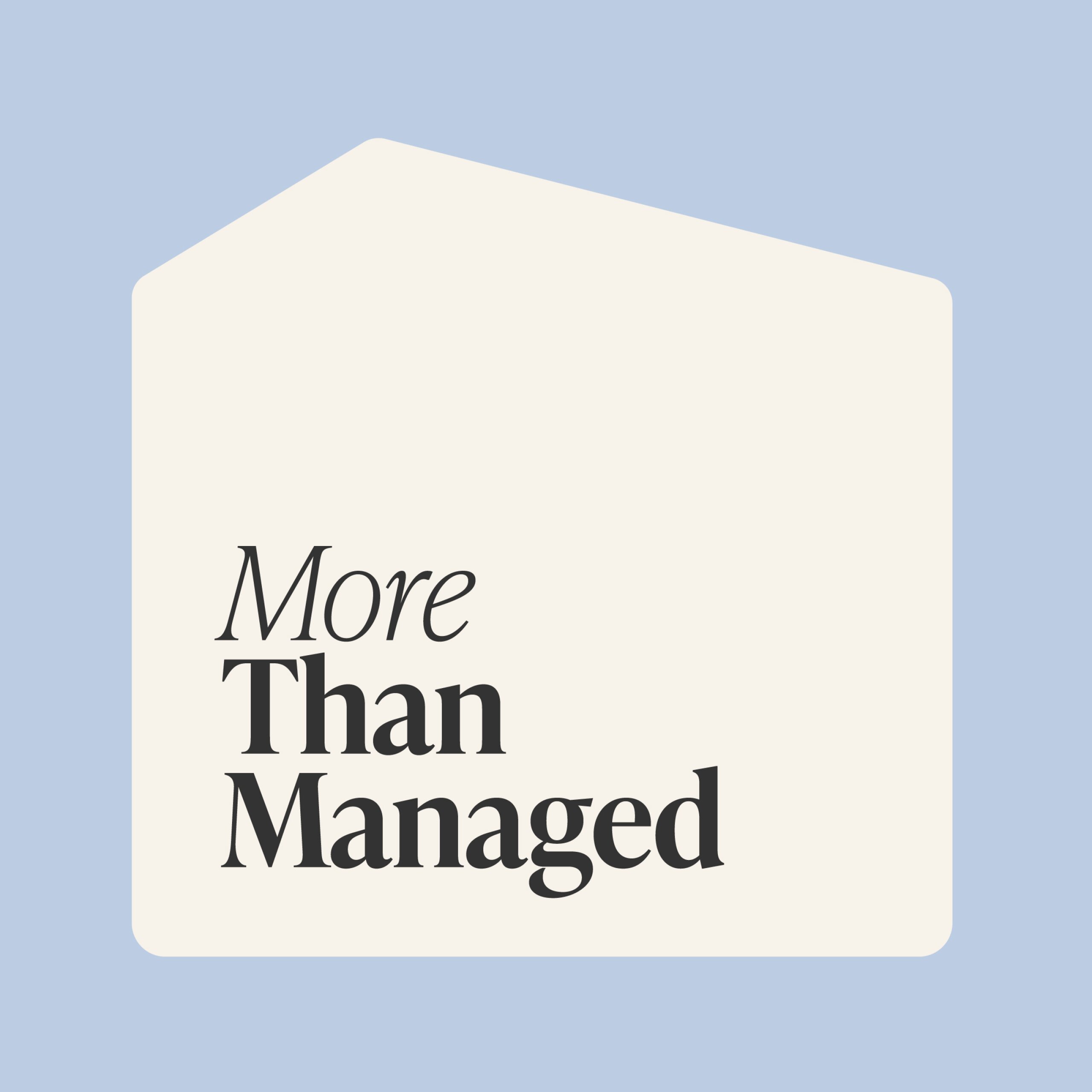
More than managed property
Brand Strategy +
Brand Identity +
Messaging +


A boutique alternative for property owners
Property management is crowded with sameness. Generic promises, navy logos and little focus on what landlords actually care about.
Flourish takes a different approach. Built on process and trust, they help Brisbane owners earn more, fill vacancies faster and find tenants who respect their homes. They needed a brand that reflected this calm, strategic alternative to the corporate real estate experience.
Brand Strategy
A landlord-first mindset
Everything starts with the landlord’s long-term goals. Flourish isn’t just about managing properties, it’s about building wealth and creating calm. The strategy positioned them as the high-touch, process-driven partner that delivers better results and builds lasting trust.

Messaging
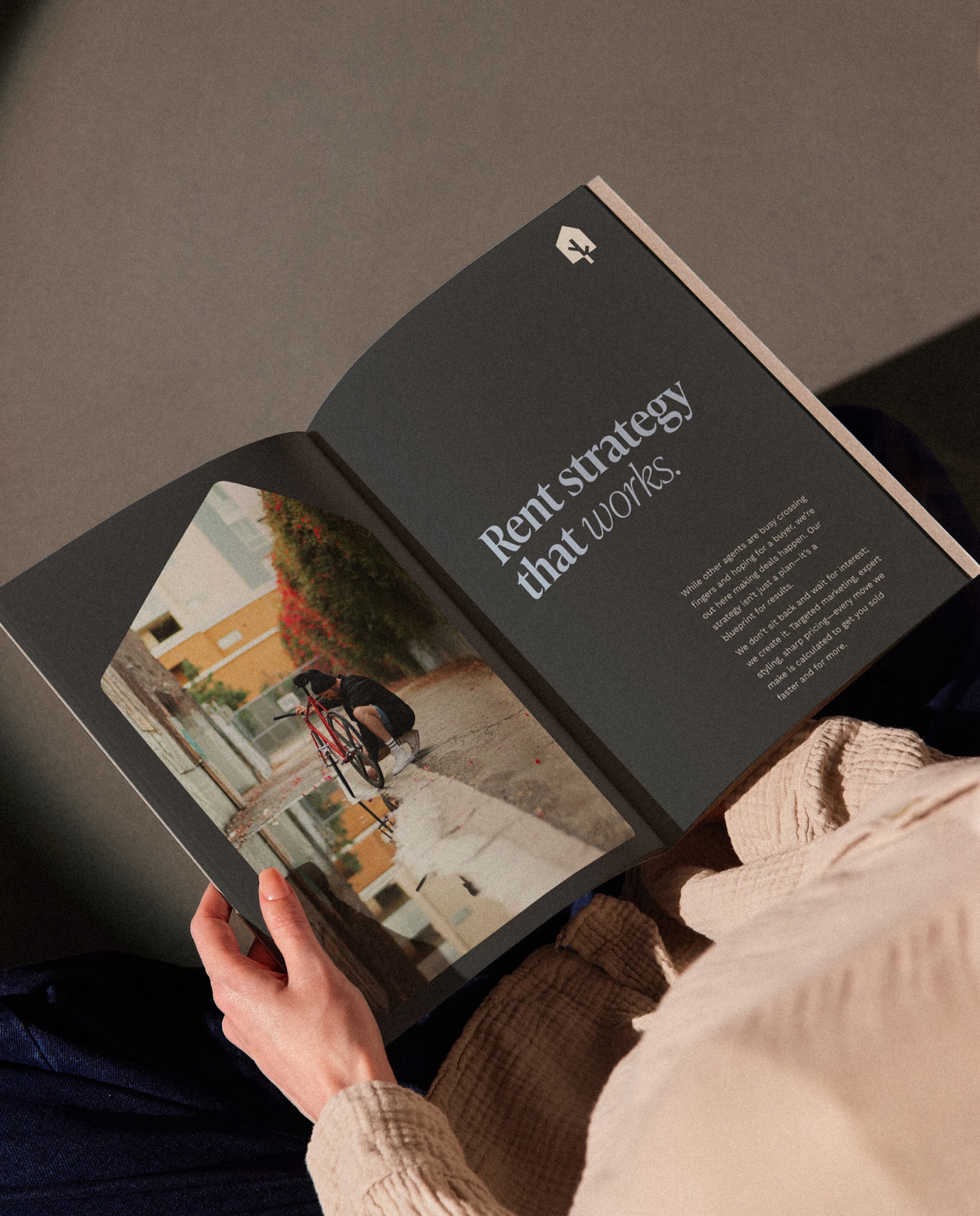
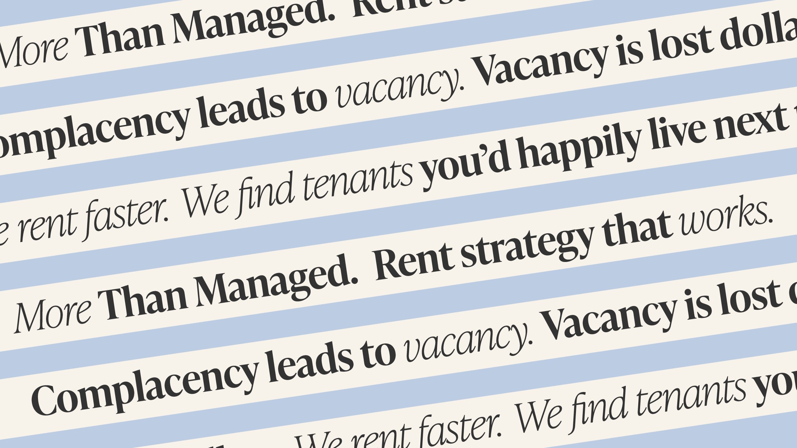
More than managed becomes the promise.
At the heart of the messaging is a clear and confident idea: More than managed.
This promise set Flourish apart from agencies that only collect rent and tick boxes. It shifted the focus to what matters most to investors: maximising returns, reducing vacancy and protecting their property. Messaging was built around smarter rent strategies, faster leasing and careful tenant selection, giving Flourish a voice that is direct, outcome-focused and easy to connect with.

Brand Identity
Calm, modern and unmistakable
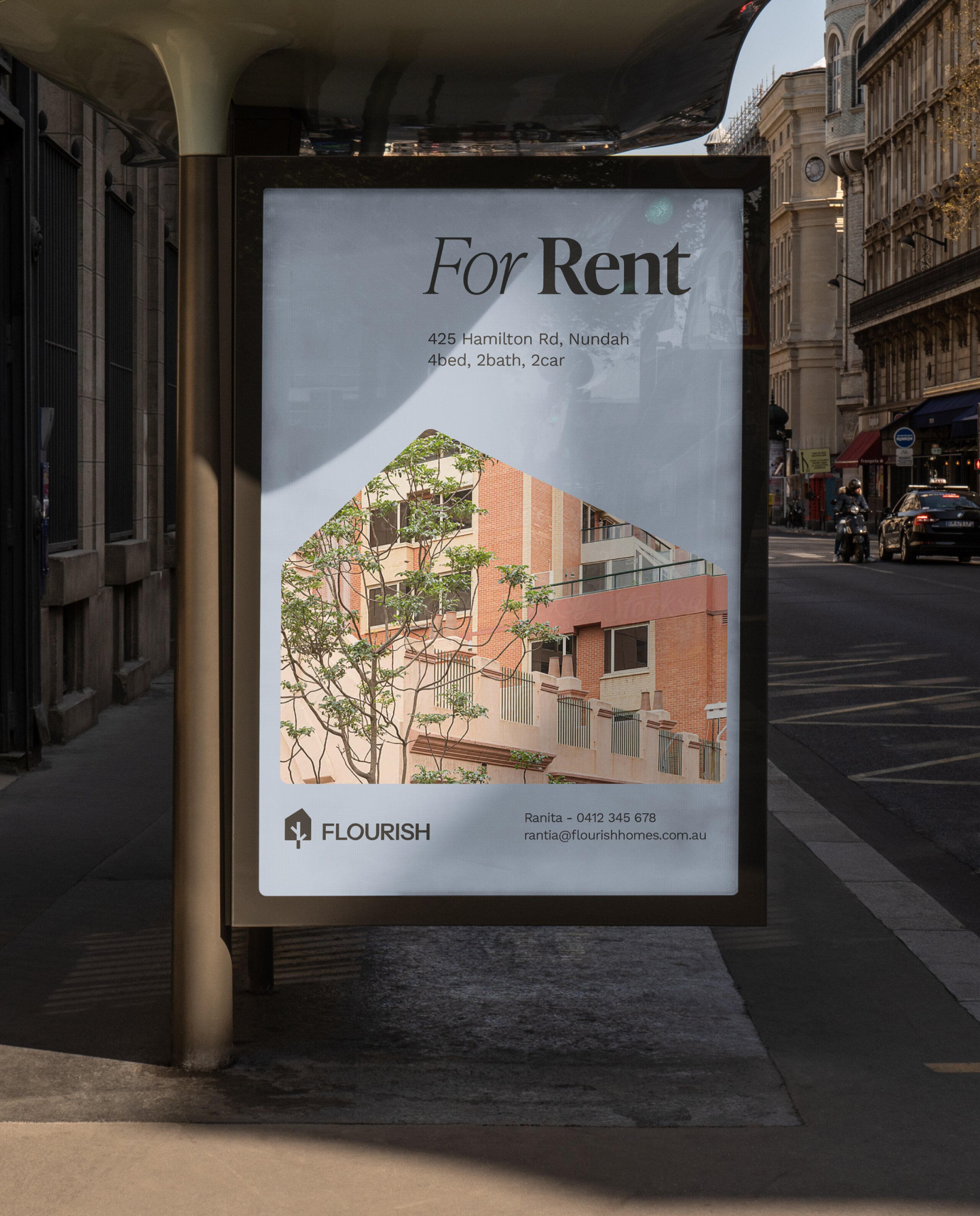
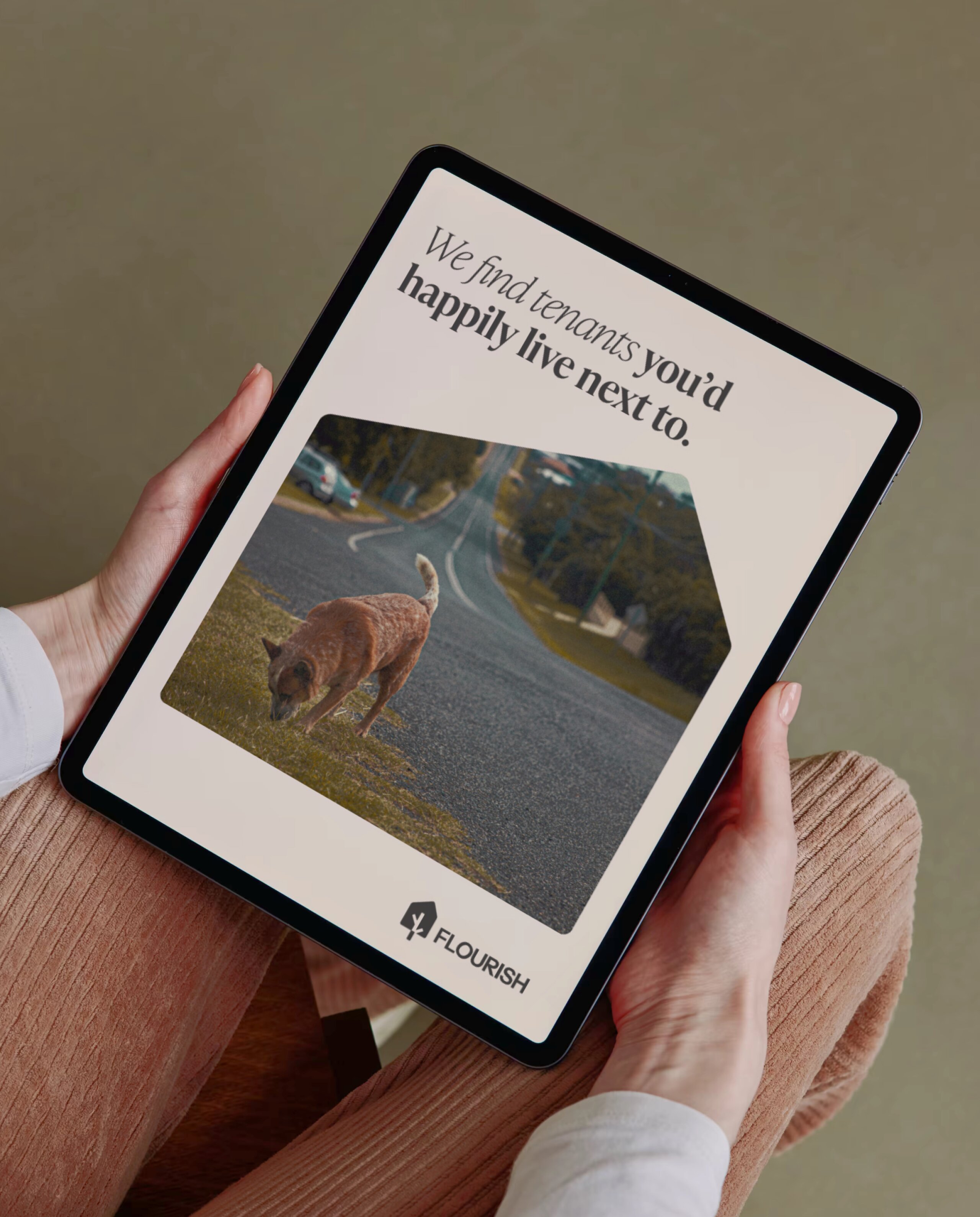
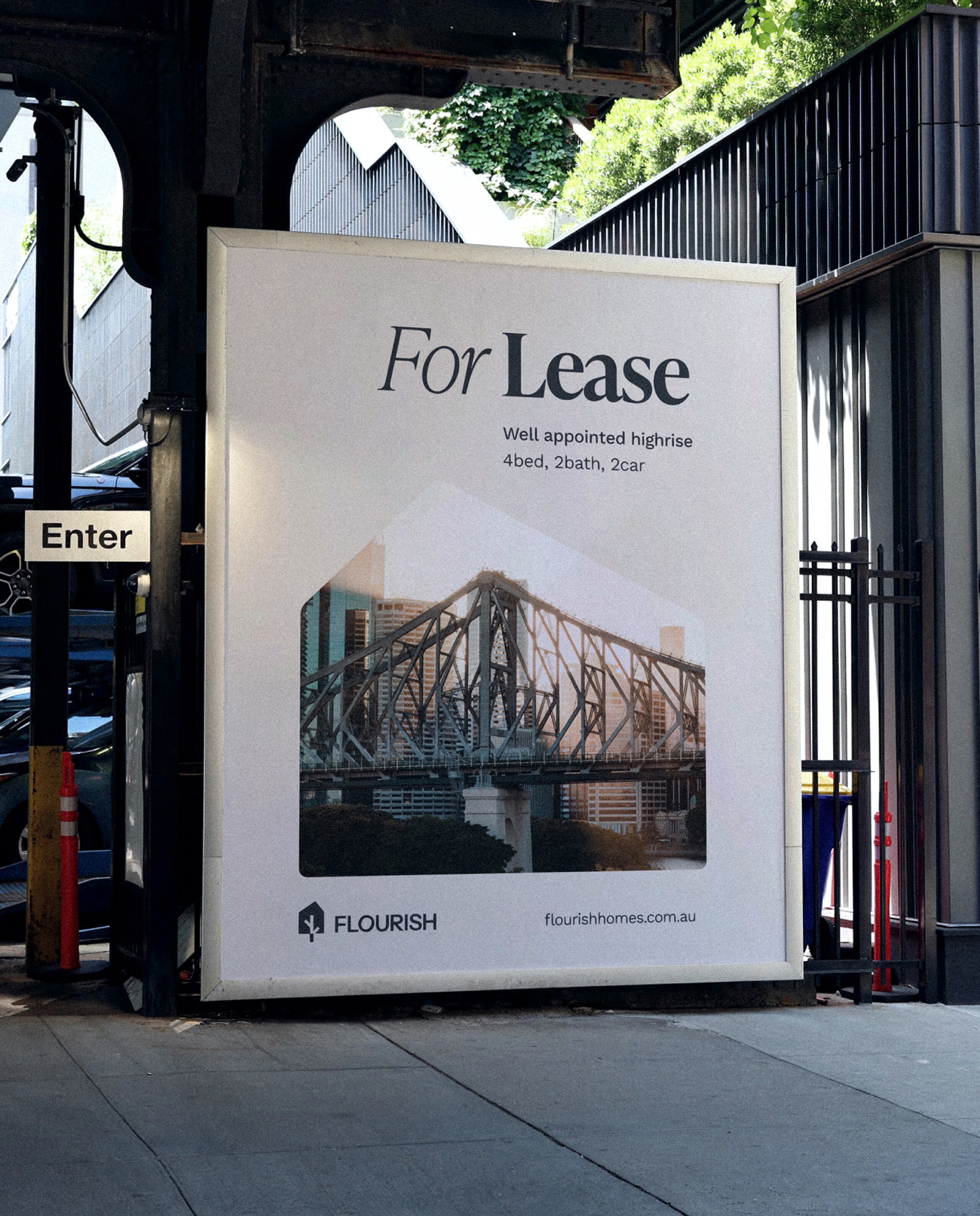
The visual system was designed to feel bright, refined and human. More lifestyle magazine than franchise real estate.
Clean and confident with refined typography and breathable layouts.
Boutique, not corporate with a palette that is warm, modern and premium.
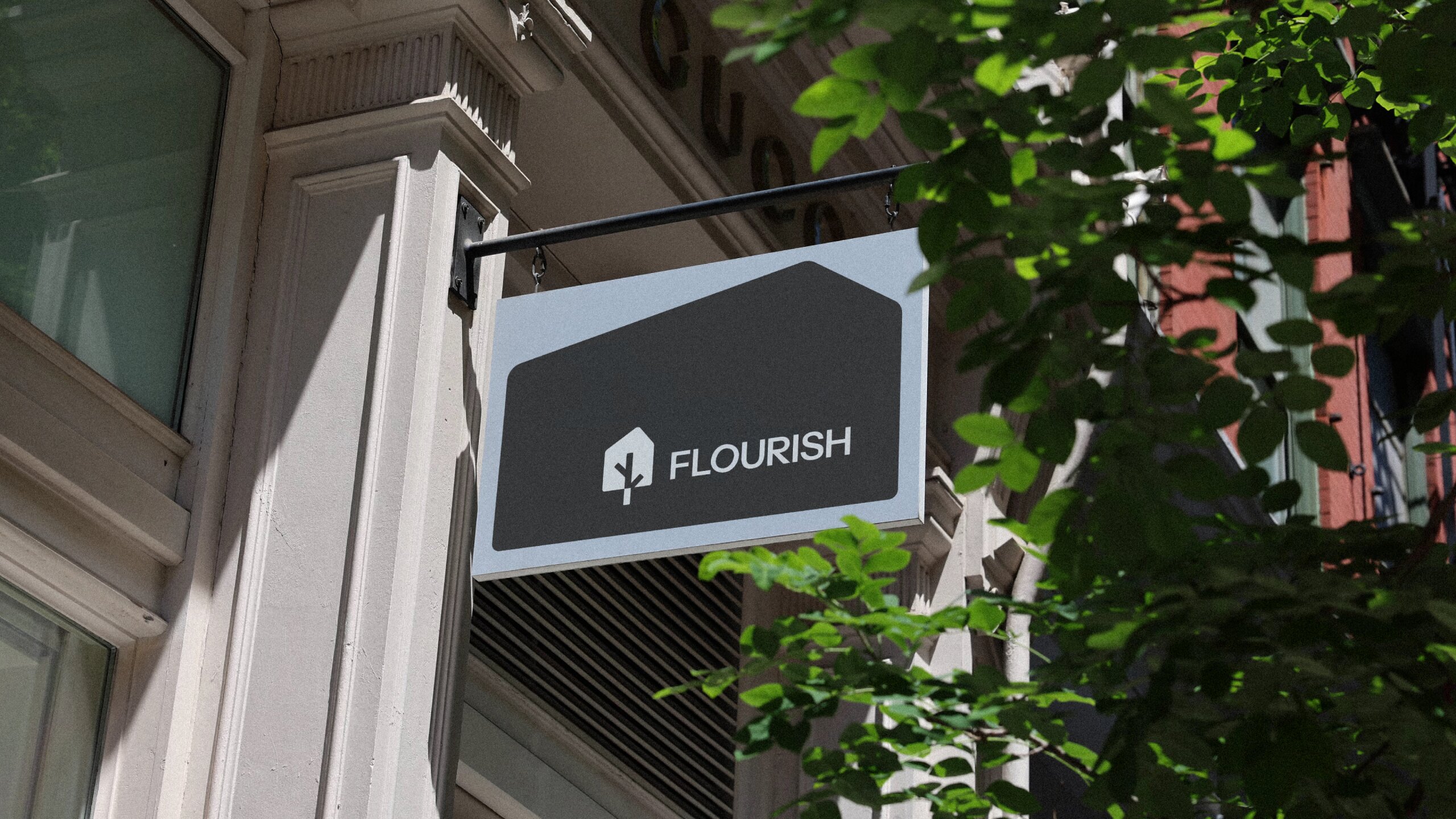
Distinctive and flexible with a unit-inspired mark that works across signage, digital and merchandise.
The identity signals authority while staying approachable. A brand that feels as considered as the service itself.

Key Takeaways
Clients want outcomes, not promises
The new brand speaks directly to what matters most: higher rents, fewer vacancies and better tenants. No clichés, just results.
Boutique can still be confident
Flourish proves you don’t need to be corporate to feel assured. A modern, boutique identity can stand out while staying approachable.
Clarity builds trust
From messaging to design, every element was created to be clear, consistent and calm. That confidence is what sets Flourish apart in a crowded market.
Up Next
Prescript
Shifting a medical recruiter from just another provider to a leading brand attracting the best talent.