Prescript
Attracting more doctors to the bush
Brand Strategy +
Brand Identity +
Website +


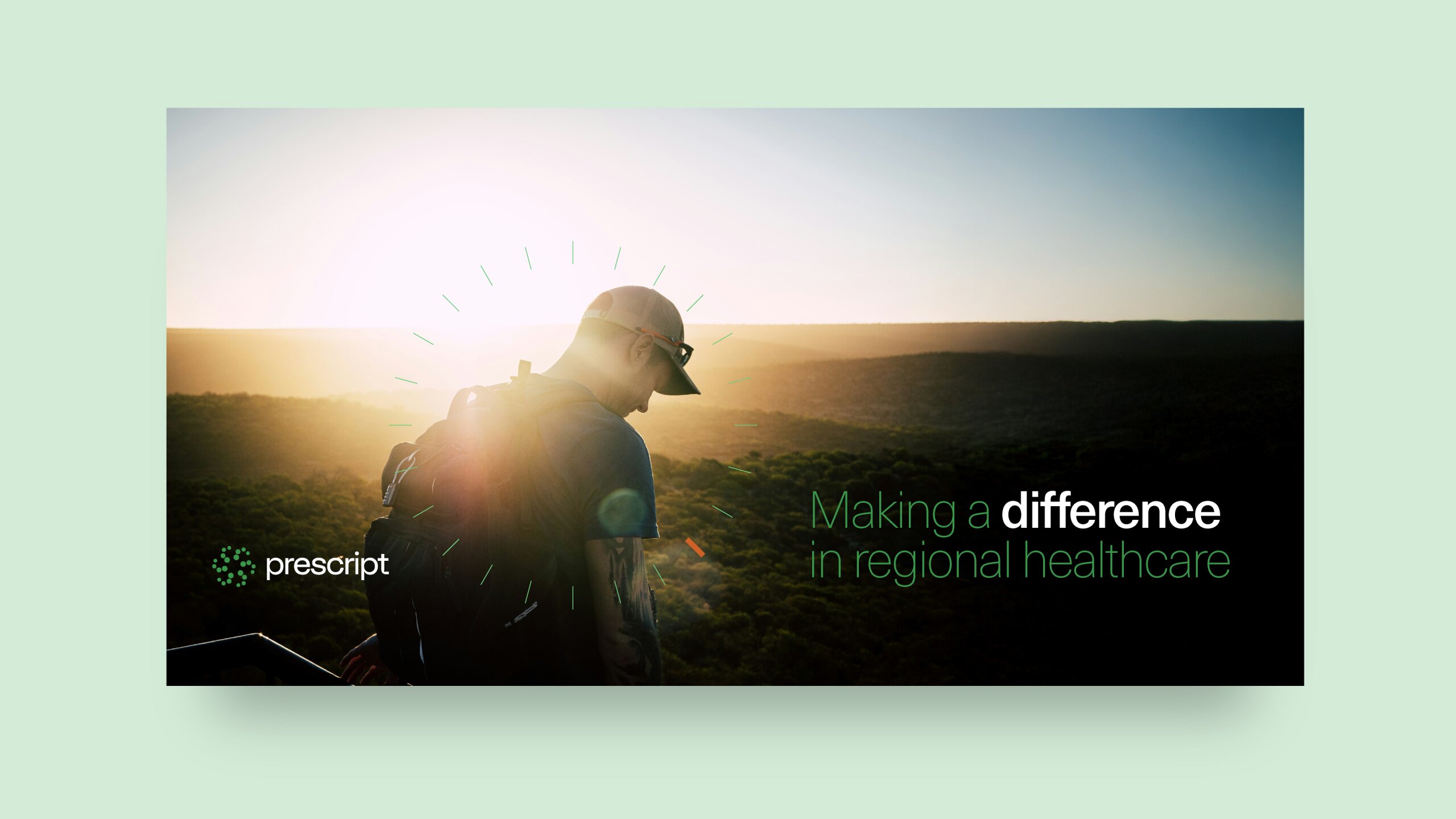
A lifeline for regional healthcare.
Prescript has been solving Australia's regional doctor shortage for over a decade. Their impact was undeniable, placing doctors in remote communities across the country but their brand looked like just another recruiter.
They weren't. Prescript offered concierge-level service, treated doctors with the utmost care, and was often the difference between rural hospitals staying open or closing. They needed a brand and website that showed this significance.
BRAND STRATEGY
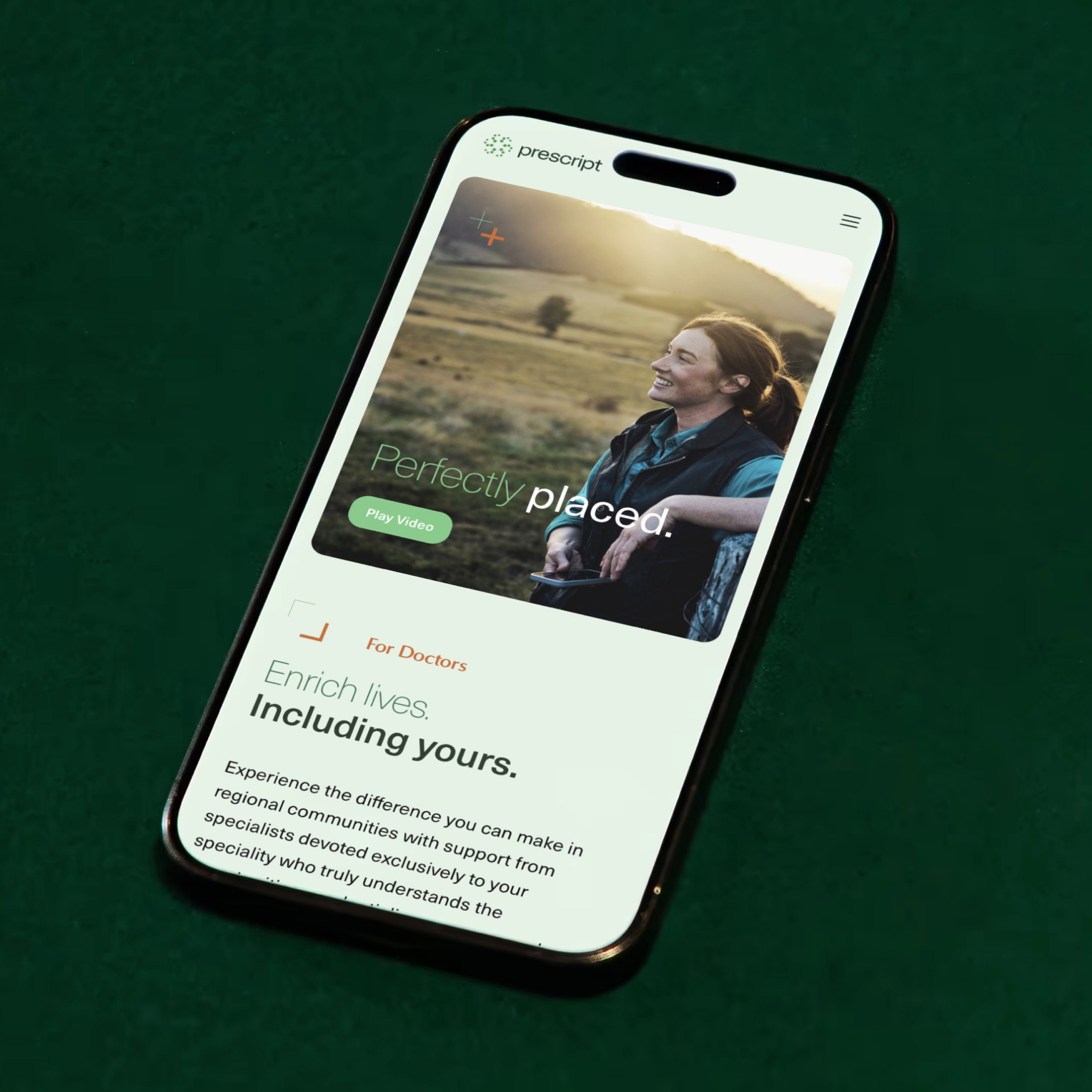
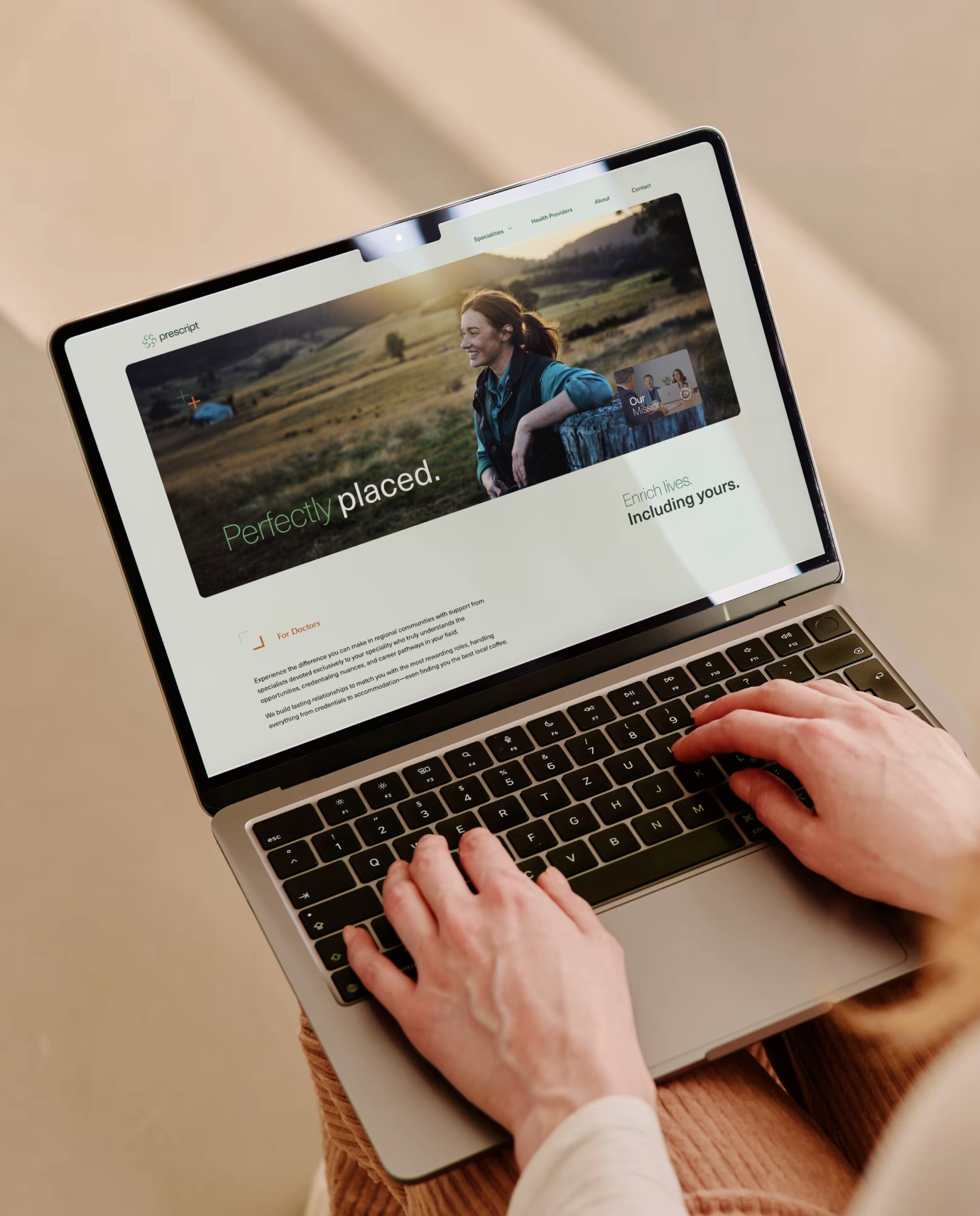
"Perfectly placed" becomes the controlling idea
The strategy workshop revealed something powerful: Prescript wasn't just filling positions. They were creating perfect matches between doctors, communities, and opportunities.
This "perfectly placed" concept became our North Star. It meant:
For doctors: finding roles that fit their career stage, lifestyle, and impact goals
For communities: getting the right specialist care they desperately need
For Prescript: positioning as the premium matchmaker, not just another recruiter
Everything flowed from this idea. The concierge-level service, the specialty-focused approach, the community partnerships, it all existed to ensure everyone felt perfectly placed. This controlling idea shaped every decision from visual identity through to website architecture.

BRAND IDENTITY
A warmer, more human look
Time to bring the "perfectly placed" strategy to life with a brand that showed the human side of premium service.
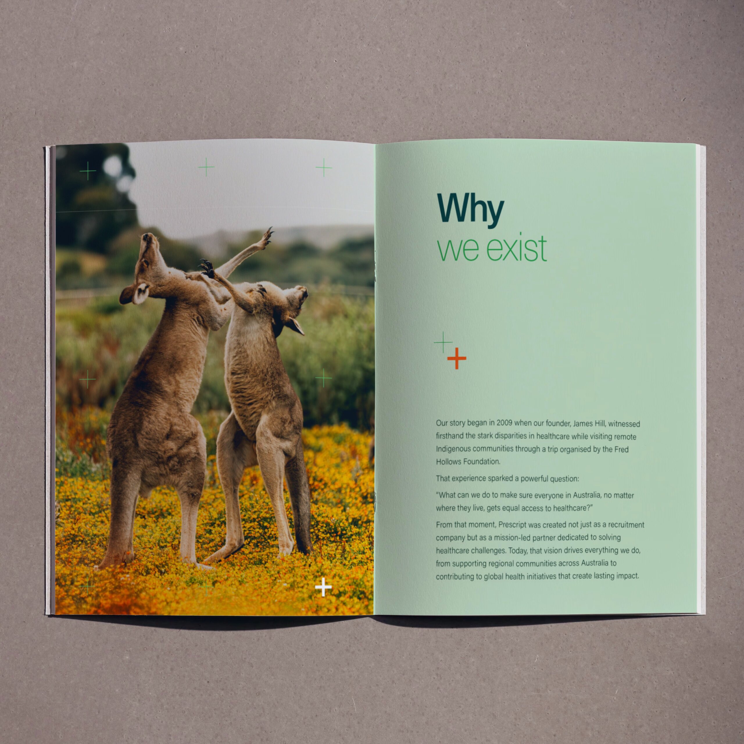
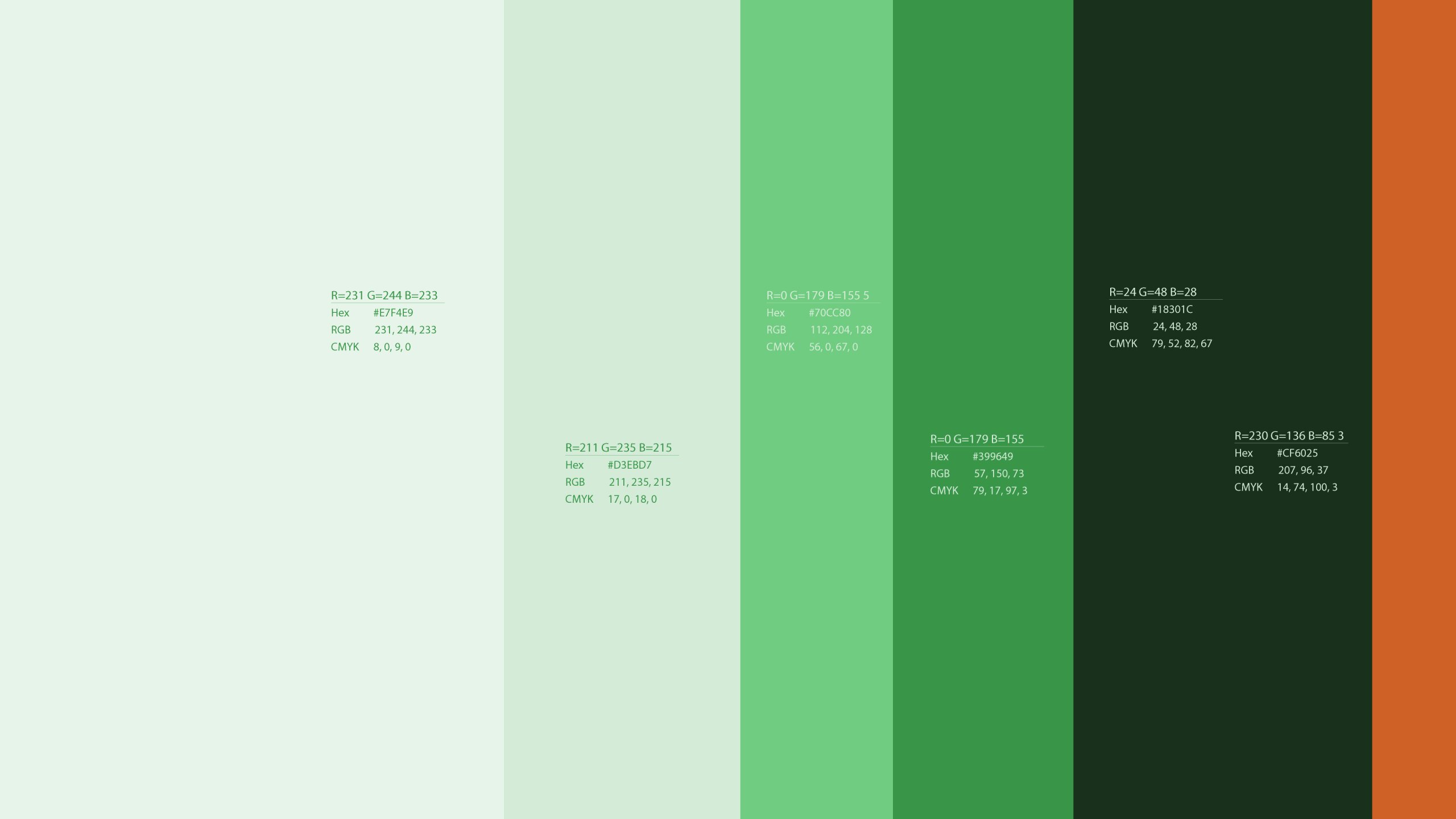
The lowercase typeface refresh made them feel like a trusted guide, not a corporate recruiter. And then the colour palette helped to support this shift away from being corporate, while having a connection to the land with earthy, natural tones like Lichen, Leaf, Grass, Forest, Earth, connected to the regional communities they serve while feeling calm and premium.
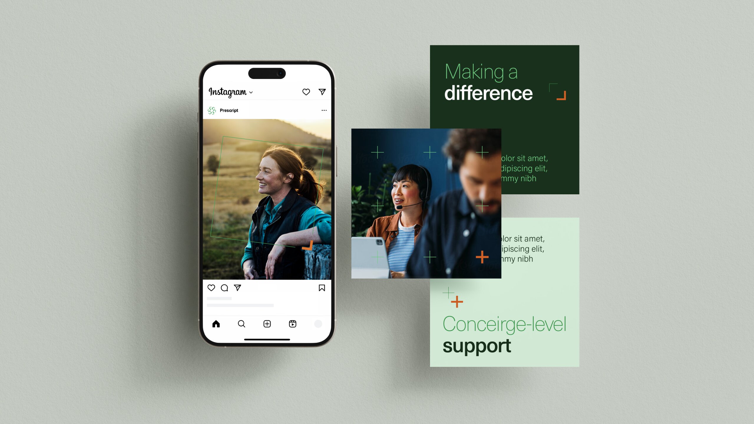
Clean rectangular frames suggested the structure and support doctors get, while a subtle medical cross nod reinforced clinical credibility. Most importantly, we ditched sterile hospital shots for real life: road trips, conversations, genuine connection. Visual stories that showed doctors what being "perfectly placed" actually looks like, both professionally and personally.
WEBSITE
Building journeys that work
The website wasn't just about looking better. It was about standing out as the recruiter of choice for doctors wanting to make a difference.
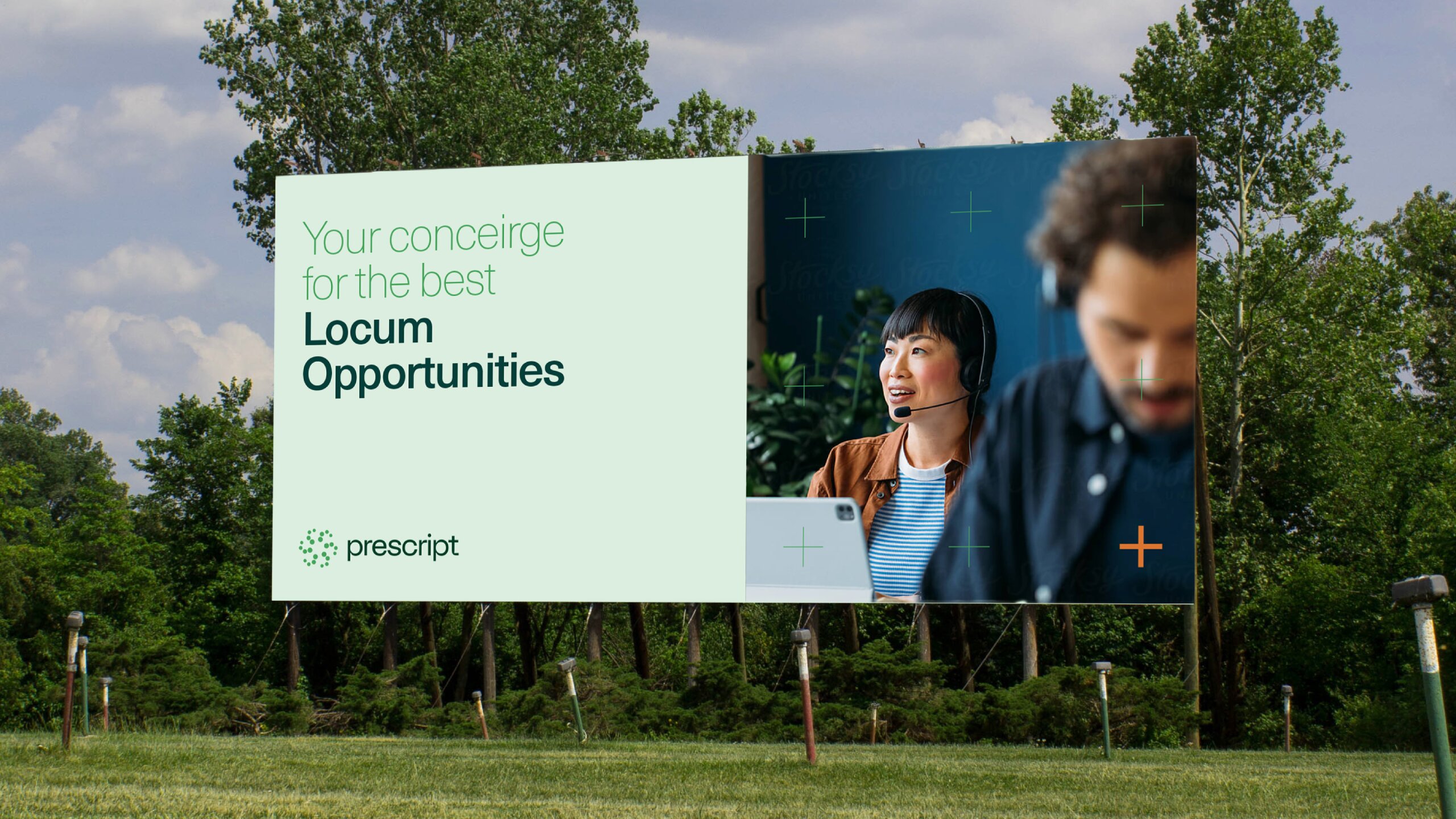
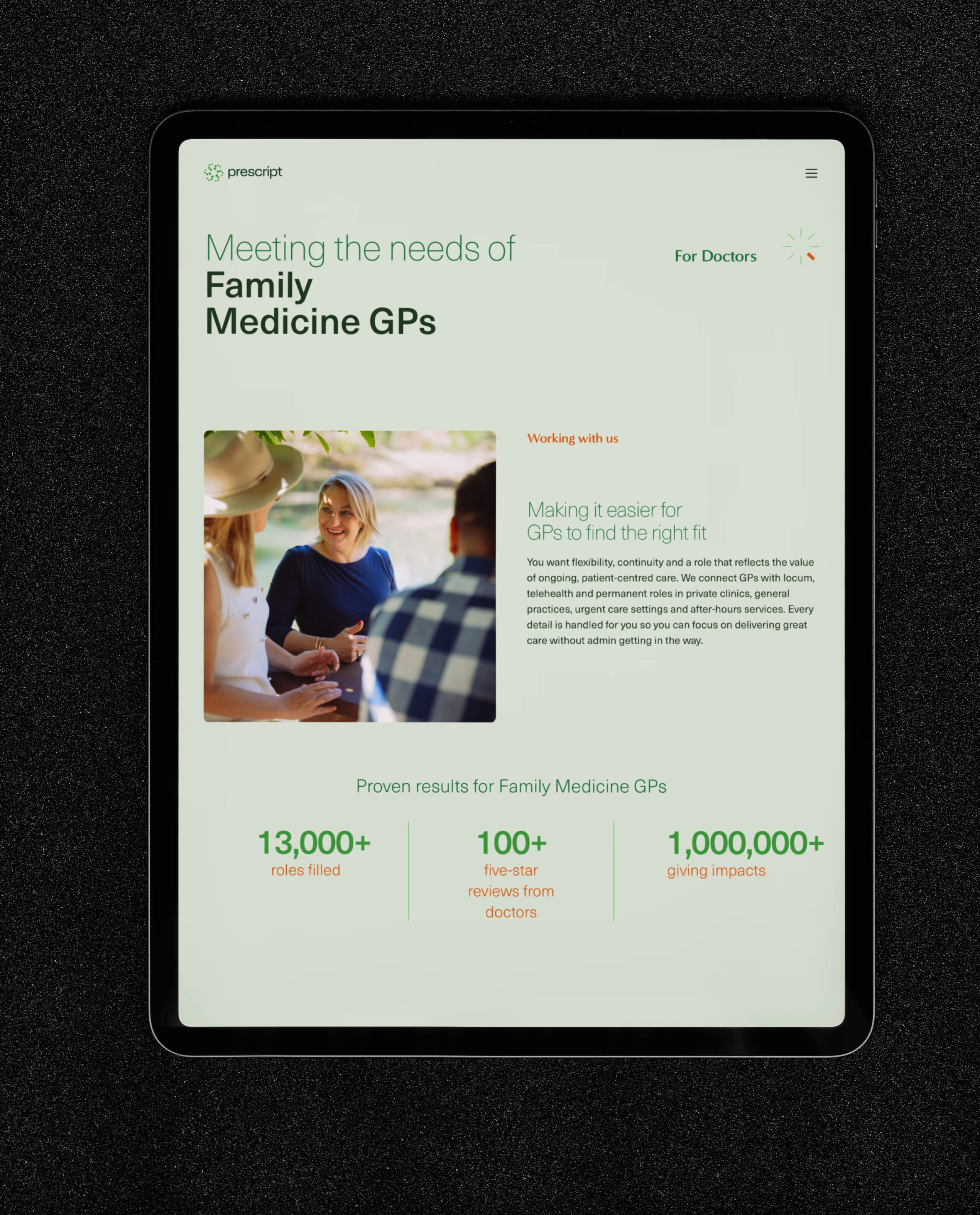
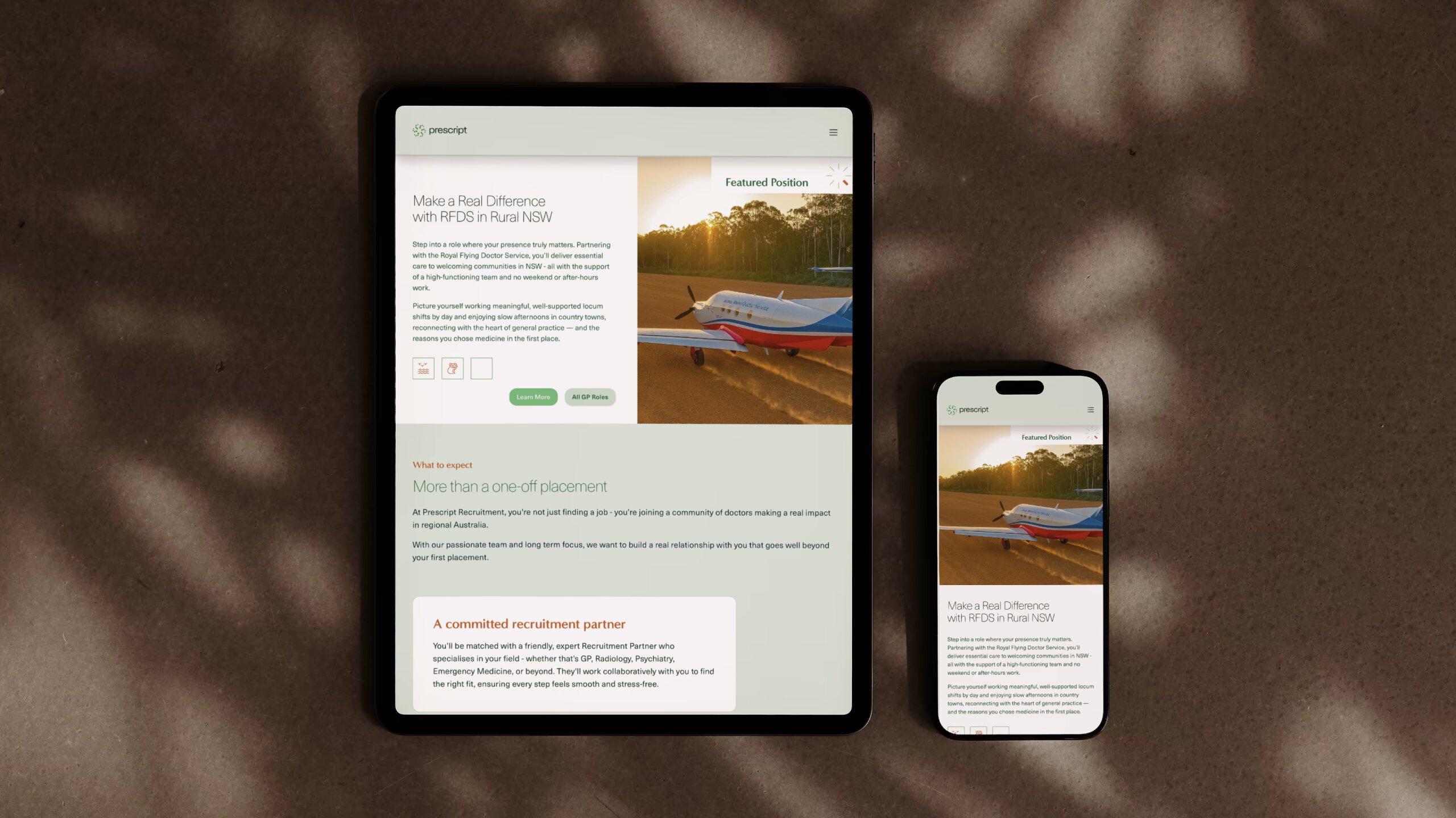
Two key audiences: doctors and healthcare providers. For doctors, we built specialty-specific journeys because a radiologist and an emergency doc need different things. Every pathway felt easy, personal, supportive.
We brought heart into it too. Working in remote communities isn't just a job. It's meaningful work. We made space for that story: the impact, the lifestyle, the purpose.
For providers, we focused on trust. ISO9001 and PQS certifications and polished layouts that showed professionalism.
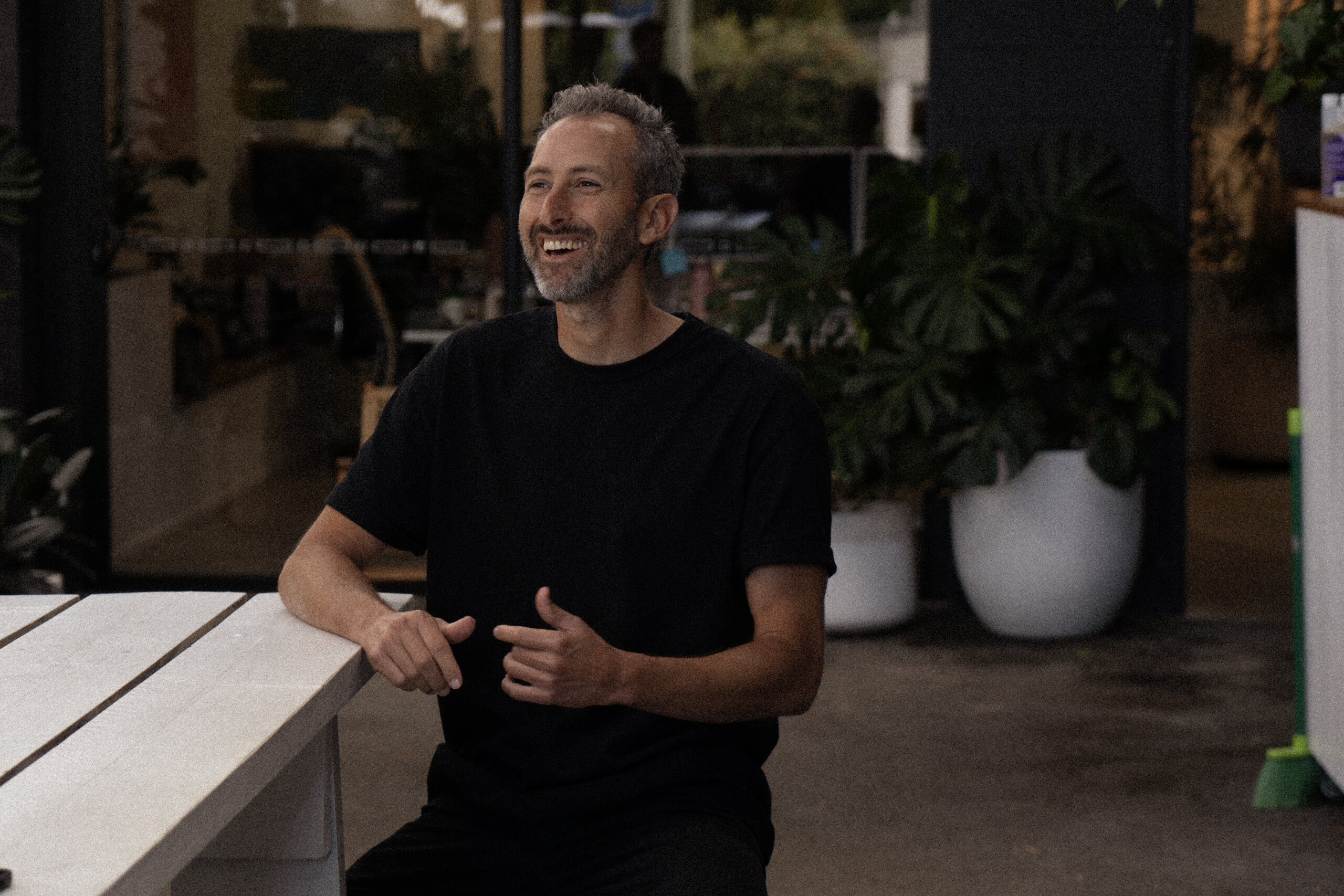
The ‘About Prescript’ shows the real humans behind the brand, people doing volunteer work, giving back, genuinely caring. That connection is what sets Prescript apart, and we made it obvious from the first scroll.
Key Takeways
One-size-fits-all journeys don’t cut it
Not everyone’s looking for the same thing. On the Prescript site, we built different pathways for different types of doctors. A radiologist needs a very different experience from someone in emergency medicine. The same goes for your business. If you want people to stick around, help them find exactly what they’re looking for from the moment they land.
If you’ve got purpose, don’t hide it
Prescript had this amazing story about helping rural communities and volunteering their time, but none of that came through before. We helped bring that story to the front, and it made the brand feel more real and more trustworthy. If your company’s doing good stuff, show it off. People want to connect with brands that actually care.
Up Next
Envirosuite
Elevating the standard for an enviro-tech platform