Fitzroy Basin Association
Making regional support easier to access
Web Strategy +
Brand Website +
Custom Web Development +
Making regional support easier to access
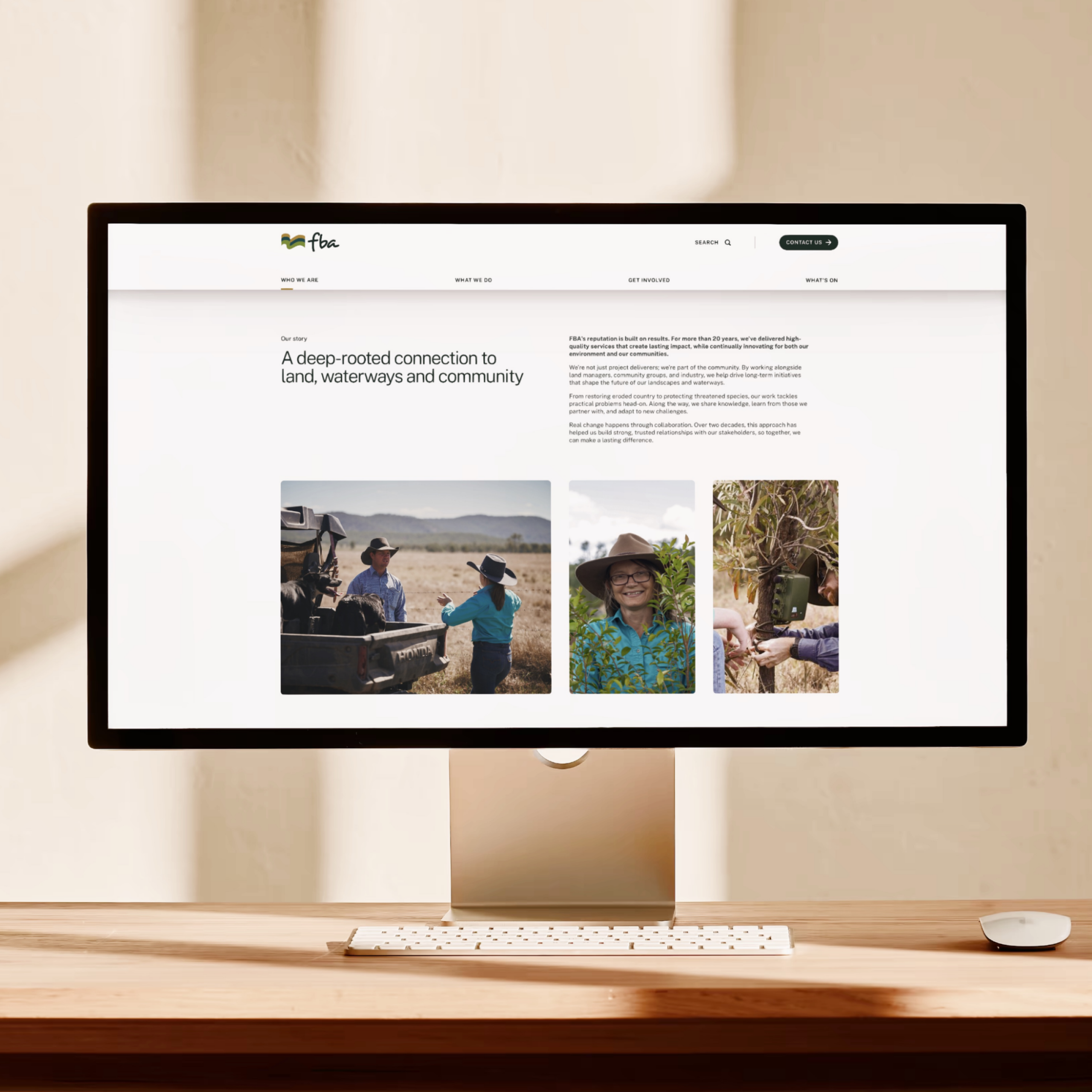
Fitzroy Basin Association delivers environmental programs, resources and community support across one of Queensland’s largest natural resource regions. Their work is practical, regional and far-reaching, but their website was no longer reflecting that scale or making it easy for people to find what they needed.
The existing site was visually dated, difficult to navigate and increasingly hard to manage. Key information sat too deep, pathways were unclear, and important updates were easy to miss. The brief was clear - to simplify the experience, improve clarity, and create a platform the team could confidently maintain over time.
The Challenge
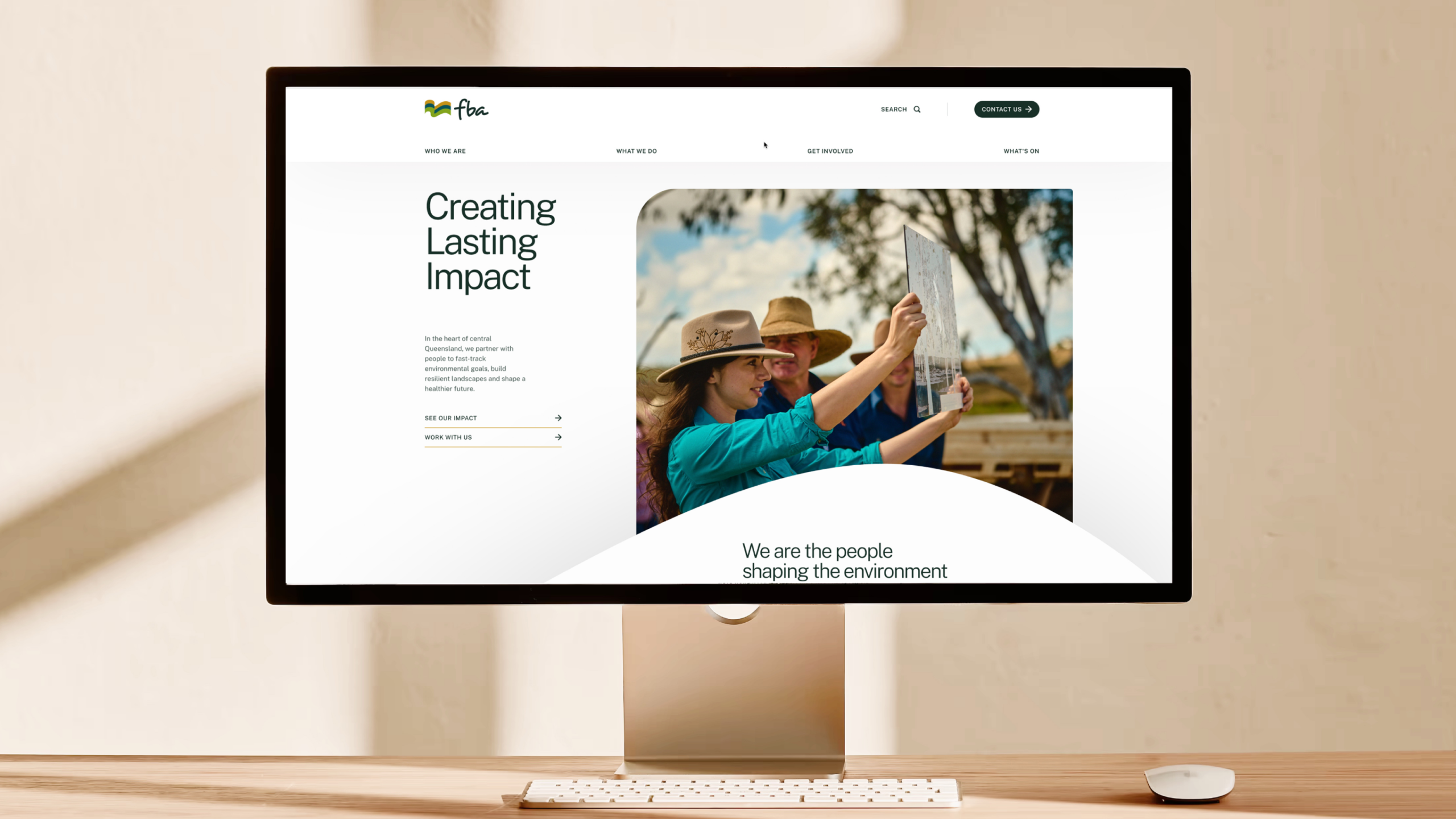
Creating clarity at scale
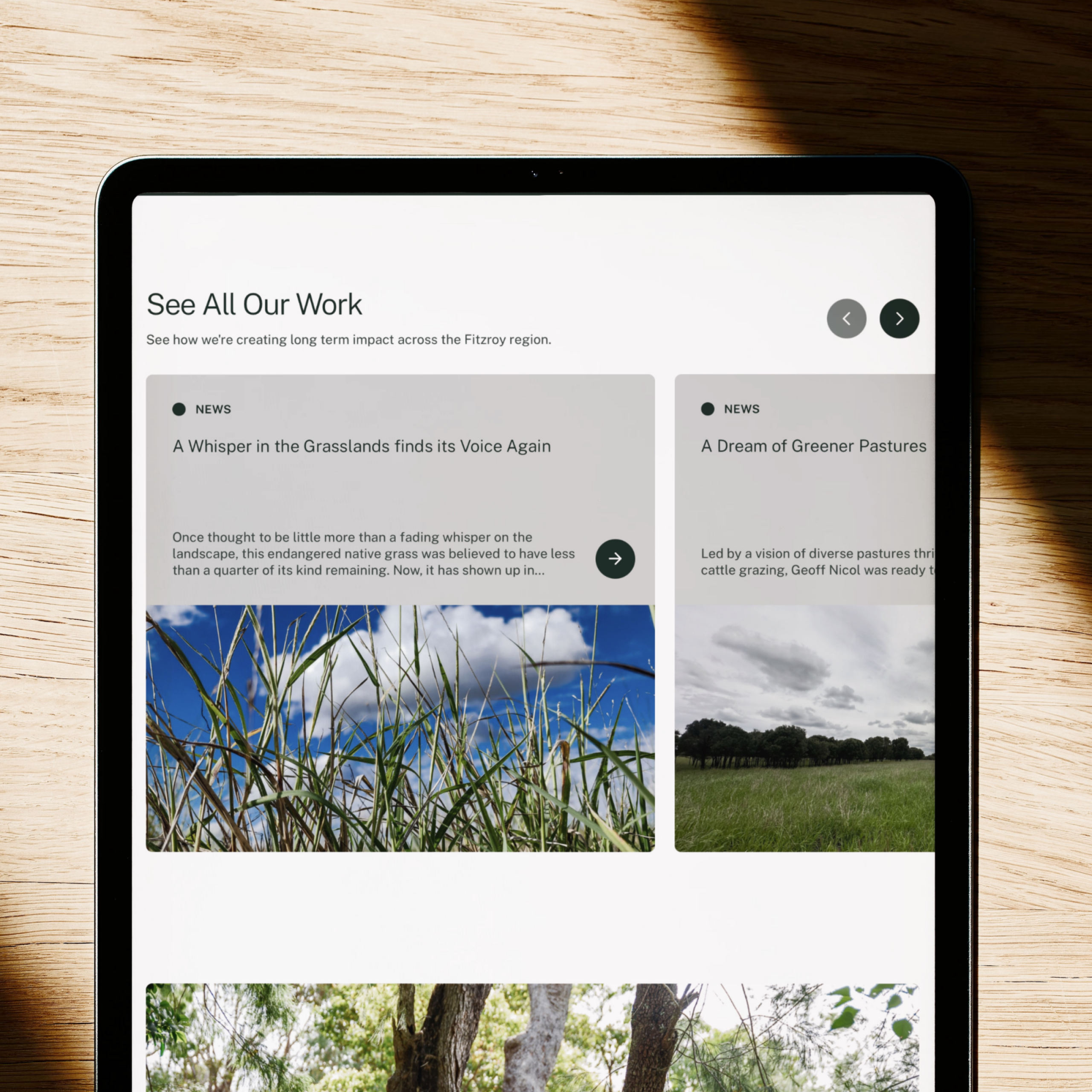
As the site grew, the experience became harder to navigate. Content lacked consistent structure, hierarchy was uneven, and users had little guidance as they moved between sections.
This made it harder for audiences such as land managers to quickly find relevant programs and resources without getting pulled into unrelated content. It also added friction for the internal team when managing content across the site.
The challenge was to bring clarity and order to a content-heavy website, without overcomplicating the experience or the system behind it.
UX and Design
Clear, calm and purpose-built
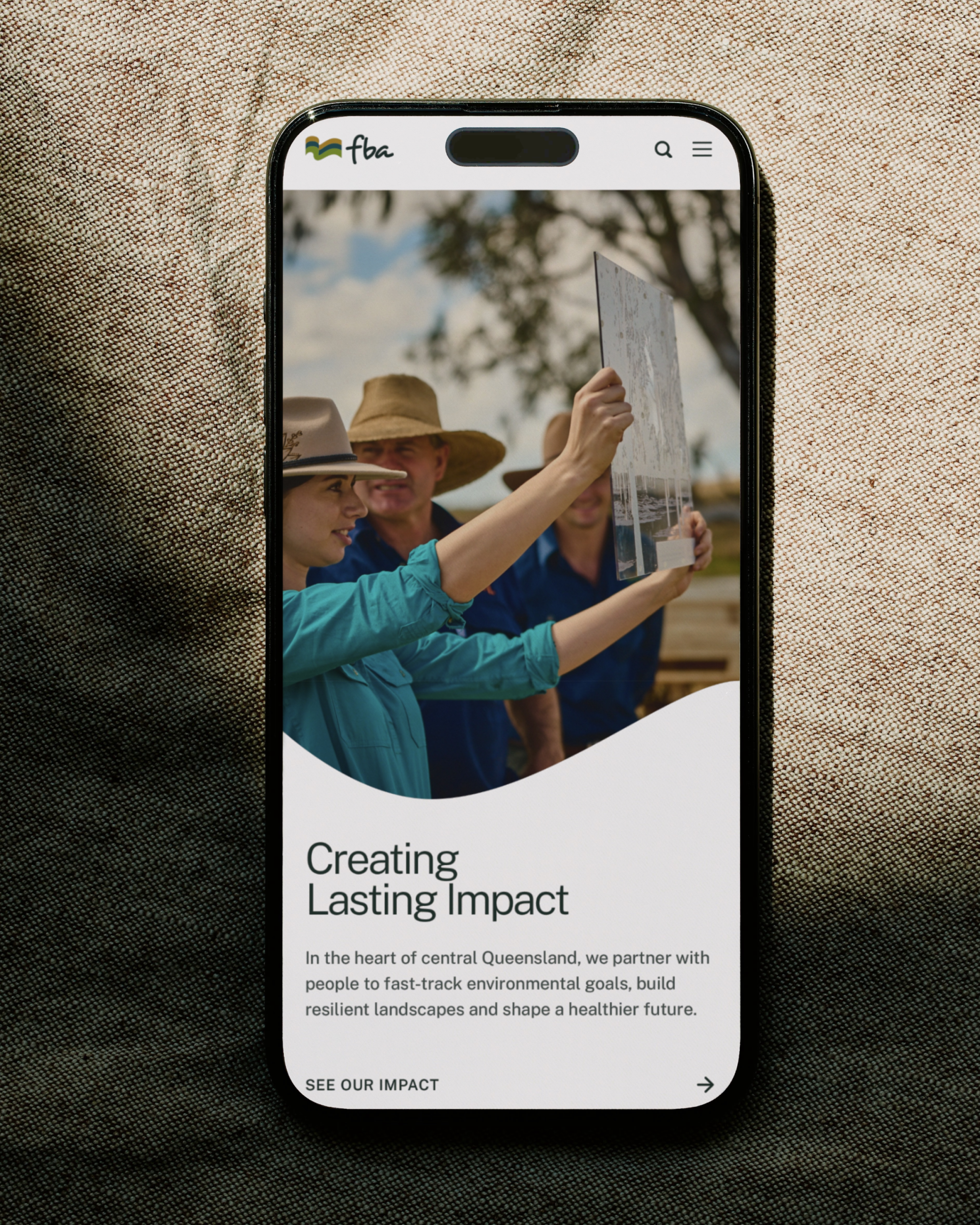
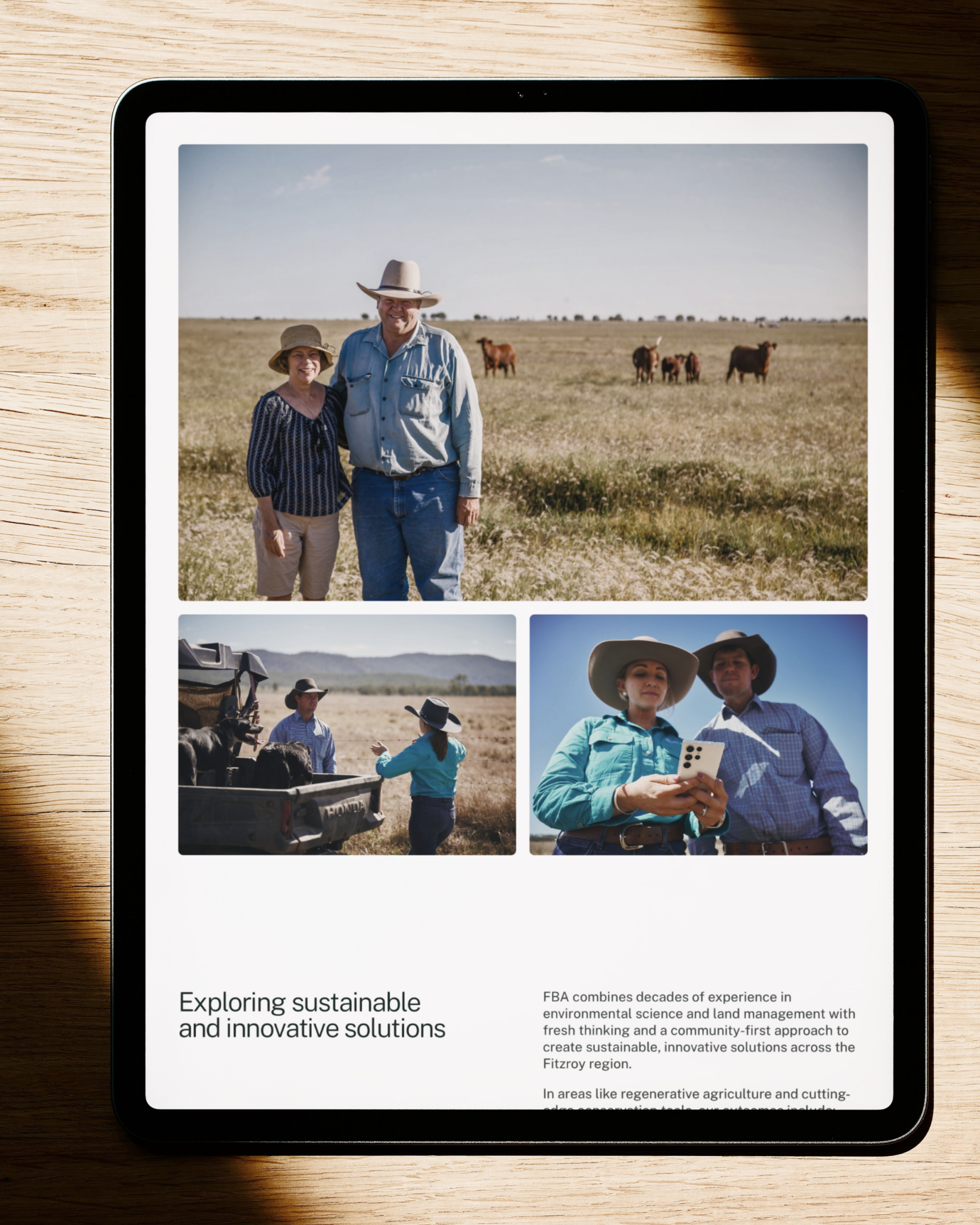
The design focused on creating a clean, contemporary interface that supports clarity first. Working within FBA’s existing brand guidelines, we refined layout, spacing and hierarchy to create a more consistent and readable experience.
The interface feels structured and approachable, with photography and white space providing context without distraction. The result is a site that feels purposeful, easy to scan and suited to a broad regional audience.
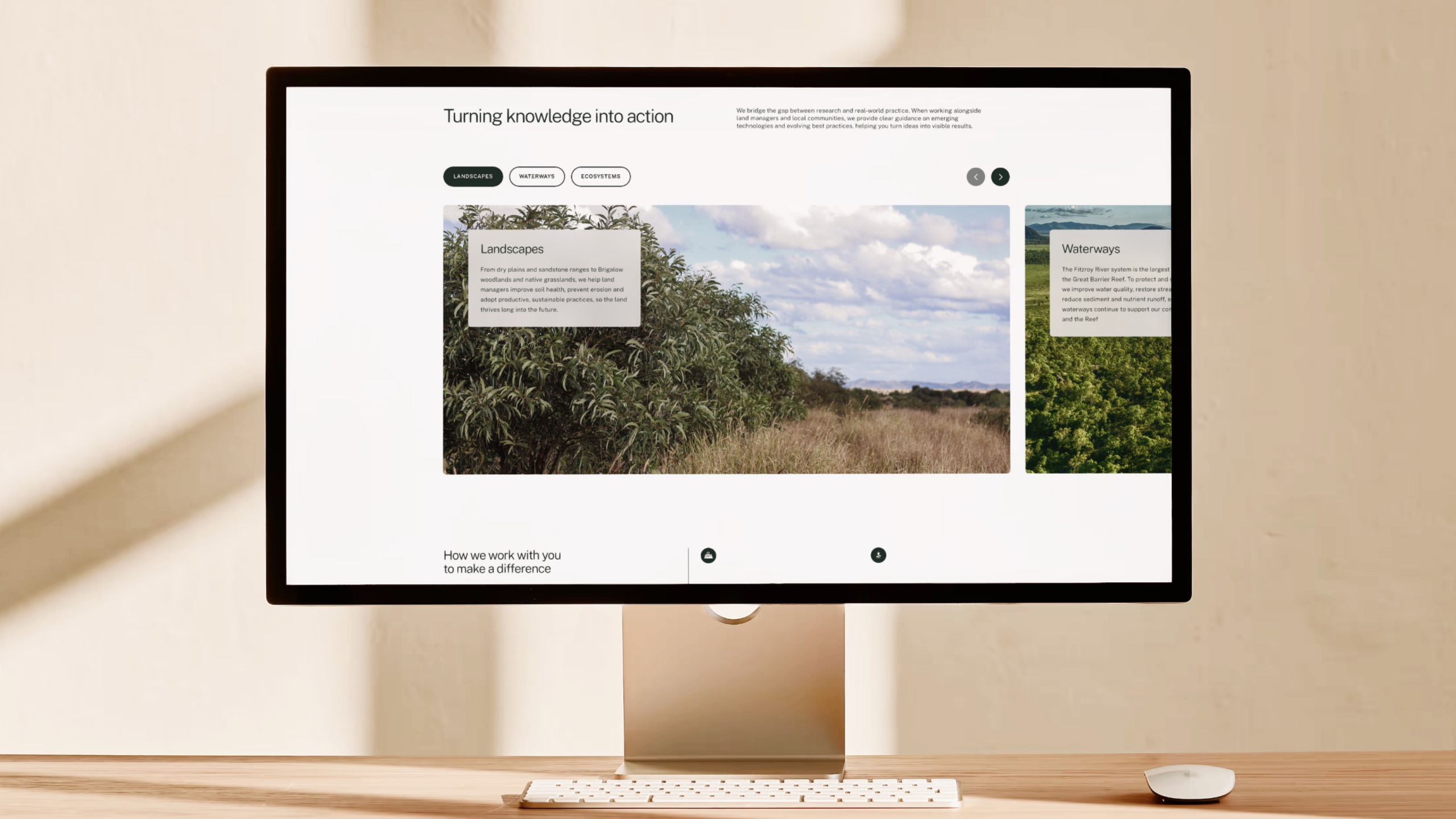
Custom Web Development
Stable, simple and fit for purpose
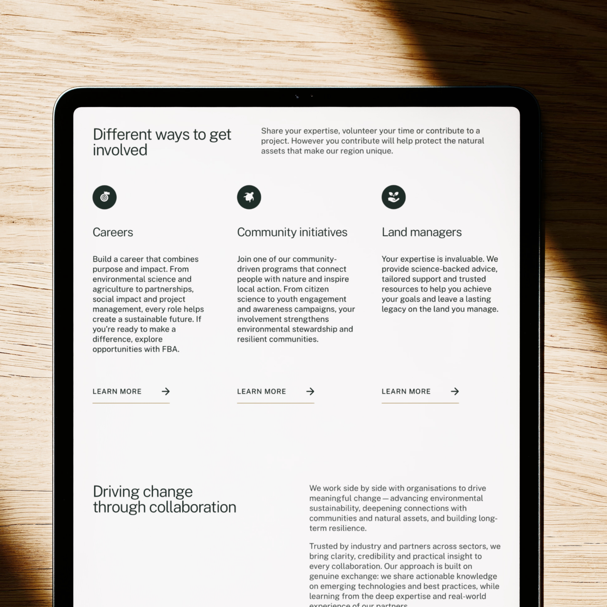
The site was custom-built with a clear, disciplined content structure that supports consistency across pages and sections. Reusable components make updates straightforward, without encouraging unnecessary expansion or complexity.
The platform provides a reliable, well-organised foundation for FBA’s core website, while leaving room for more specialised content to live elsewhere as future initiatives roll out.
The Outcome
A clear and dependable digital home
The new website delivers a clearer, more cohesive experience for users across the region. Navigation is simpler, content is easier to find, and the overall structure better reflects the scale and importance of FBA’s work.
Internally, the team now has a system that supports long-term sustainability, setting the organisation up for future phases of digital growth.
Key Takeaways
Structure creates direction
Clear hierarchy helps different audiences quickly understand what’s relevant to them and where to go next.
Guided experiences reduce noise
Well-defined pathways stop users getting lost in content and help them move through the site with confidence.
Consistency supports trust and maintenance
A disciplined design system creates a more reliable experience for users and reduces ongoing effort for internal teams.
Up Next
Flourish
A boutique identity built to cut through real estate clichés and connect with owners who want stronger returns and less stress.