Coolamon
A premium service needs a premium identity
Branding +
Website +
Stationery +

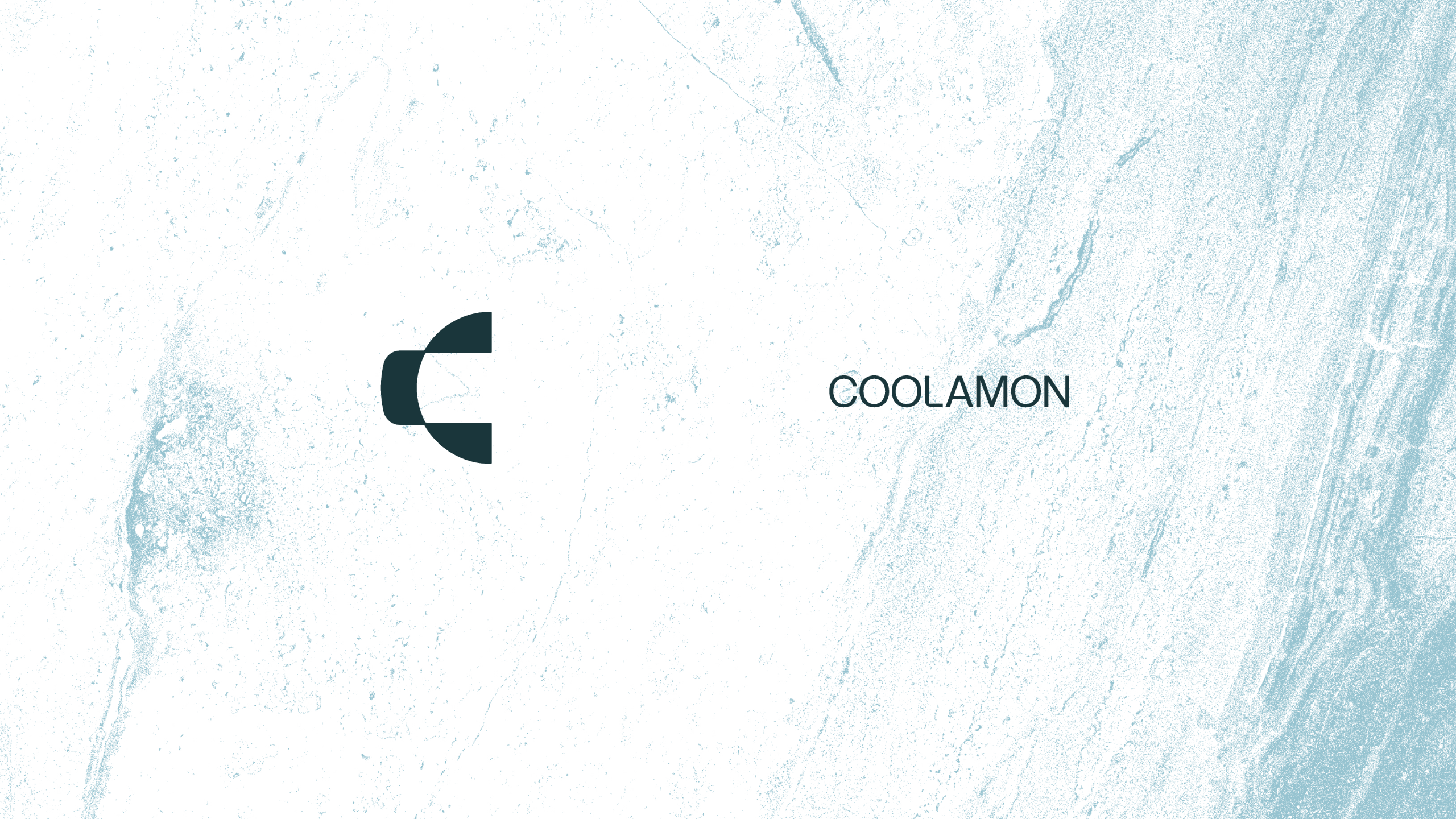
Inspired by precision, strength and the built environment
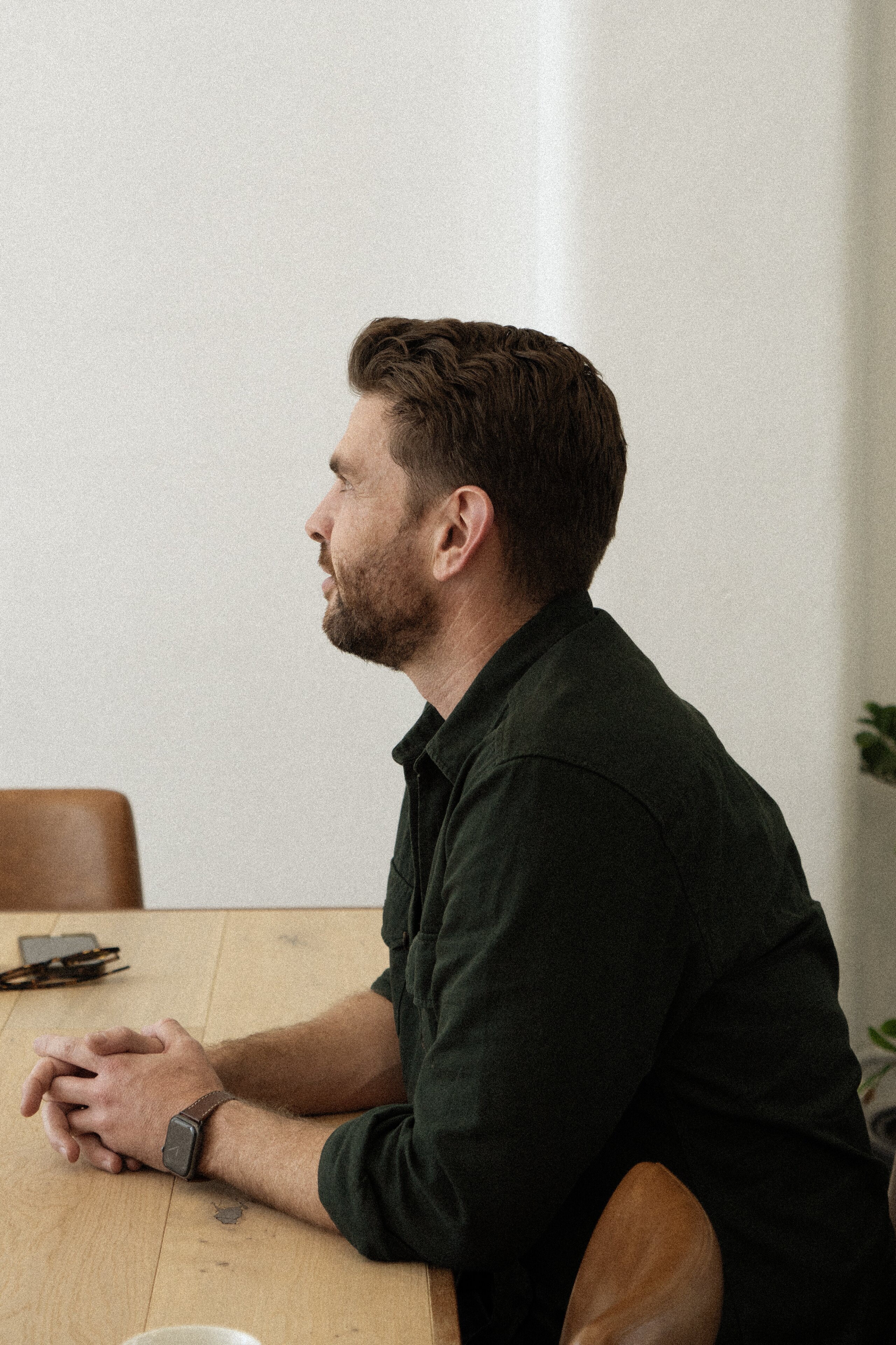
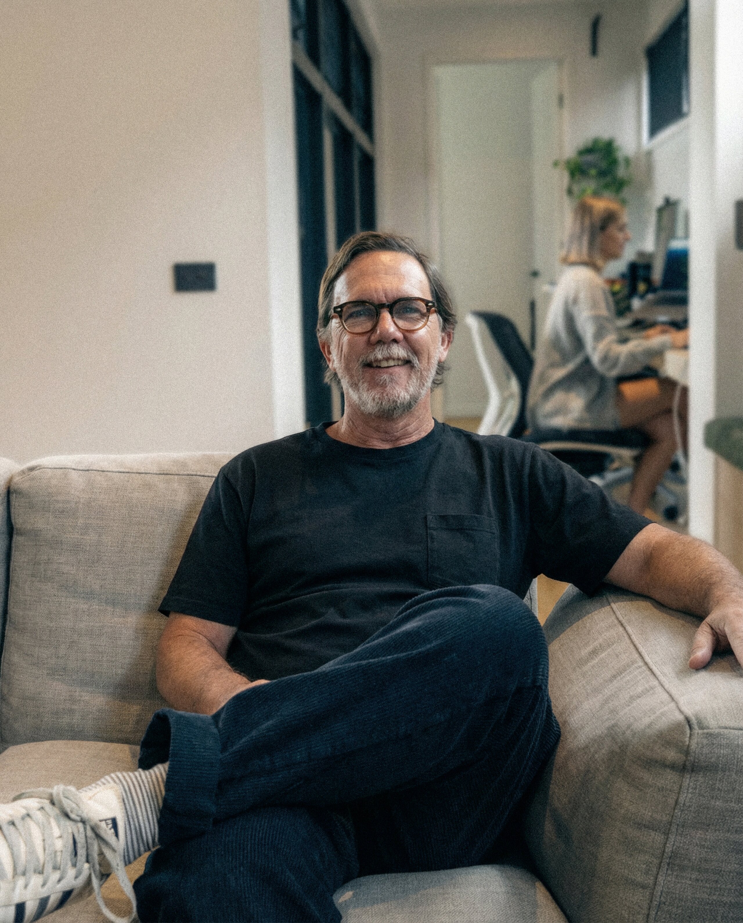
When crafting the branding for Coolamon, we worked closely with Sam and Bennett to understand who they were and what they wanted the business to represent. The guys put a lot of work, experience and thought into their work, and wanted a brand that would convey this technical precision, as well as reflect the strength of their experience.
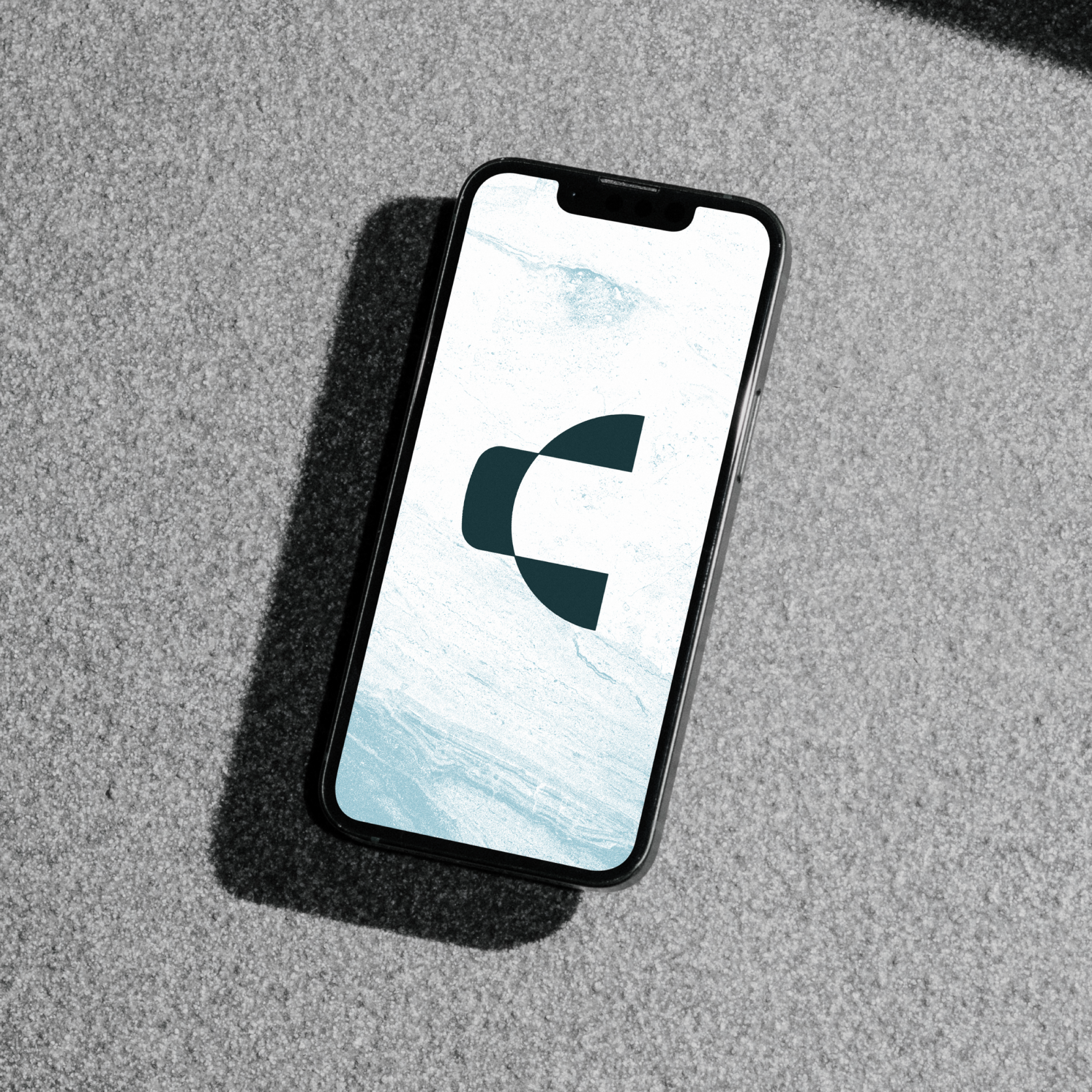
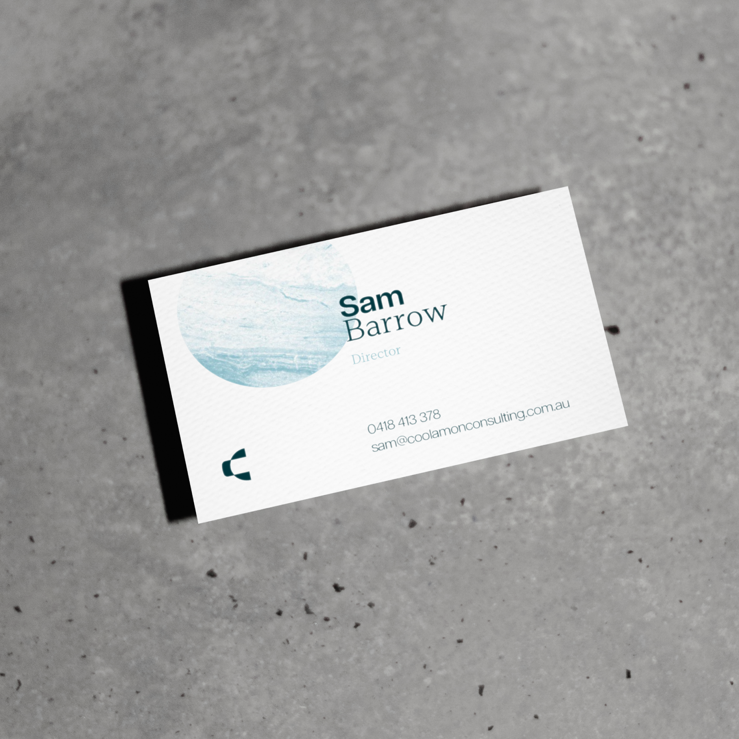
We then took inspiration from the built environments that they work with, using interested textures that give the brand depth.


Visual Identity
The brand's in the details
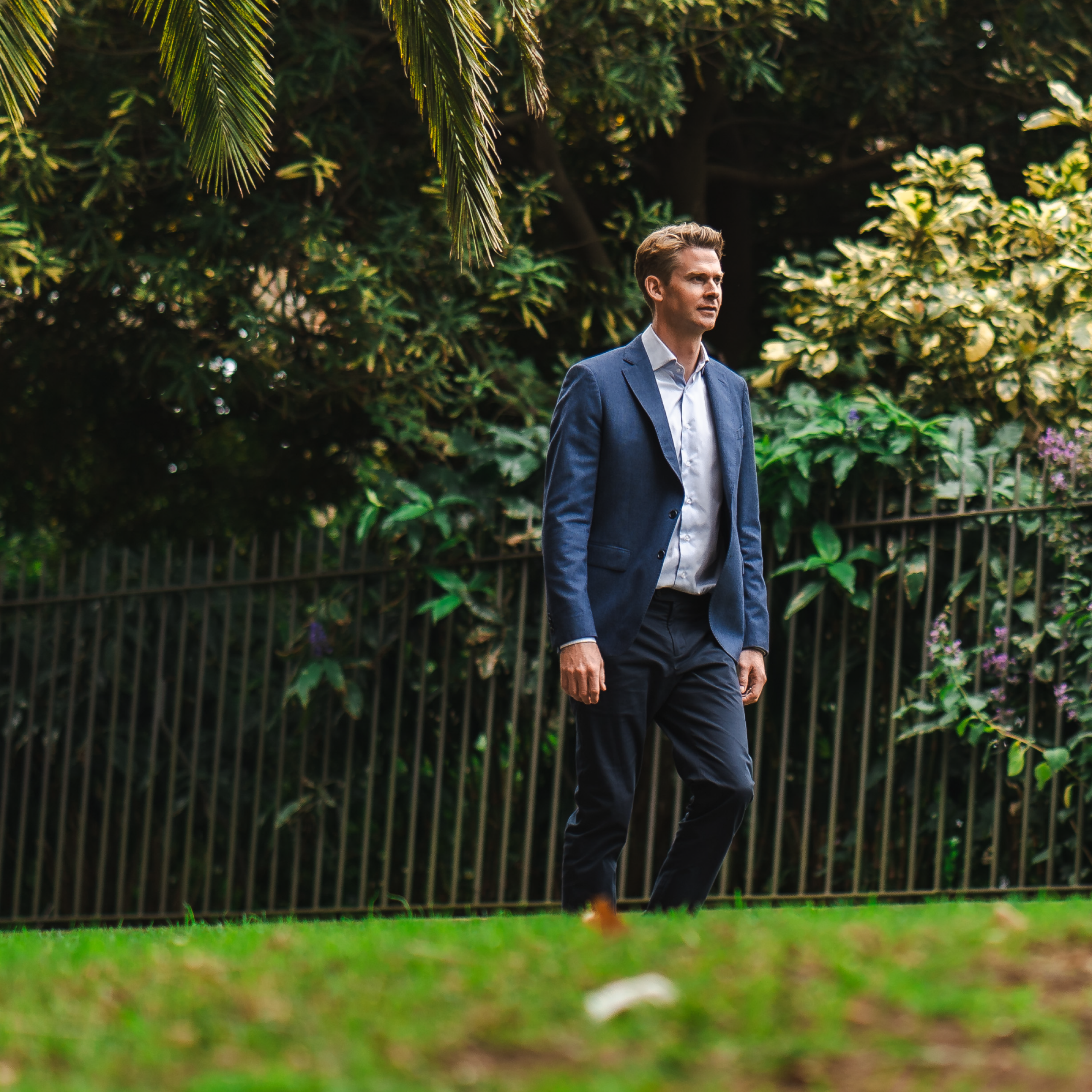
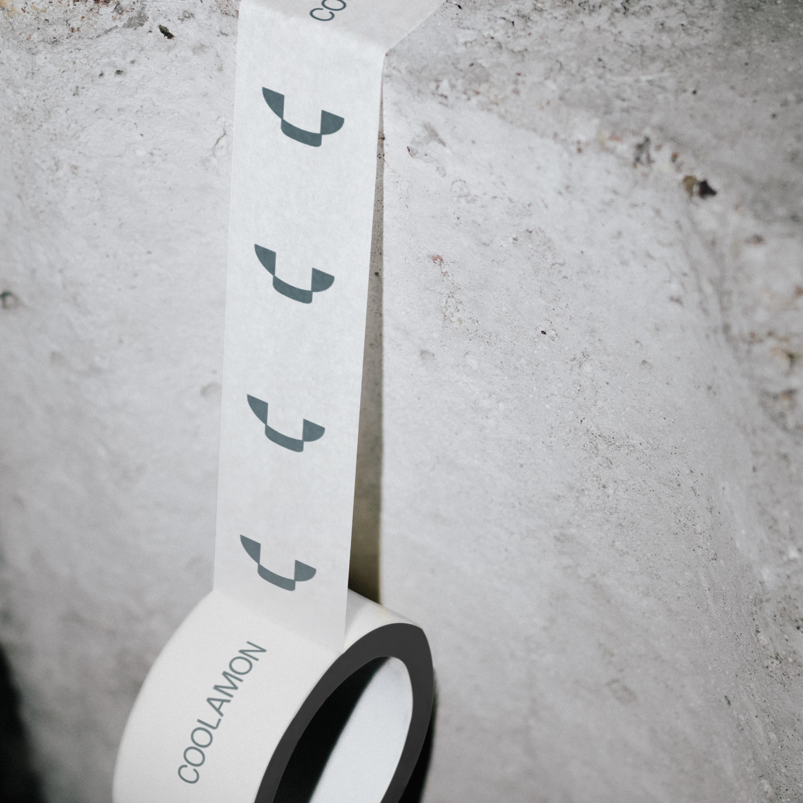
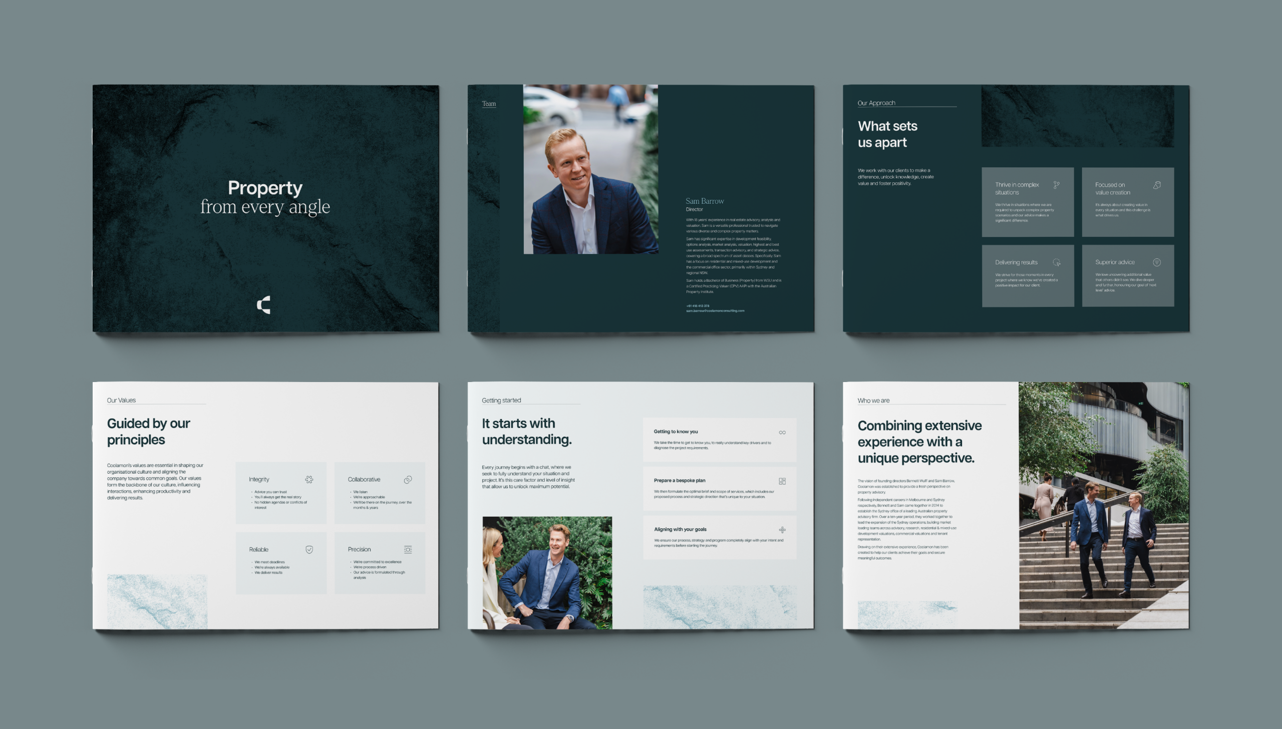
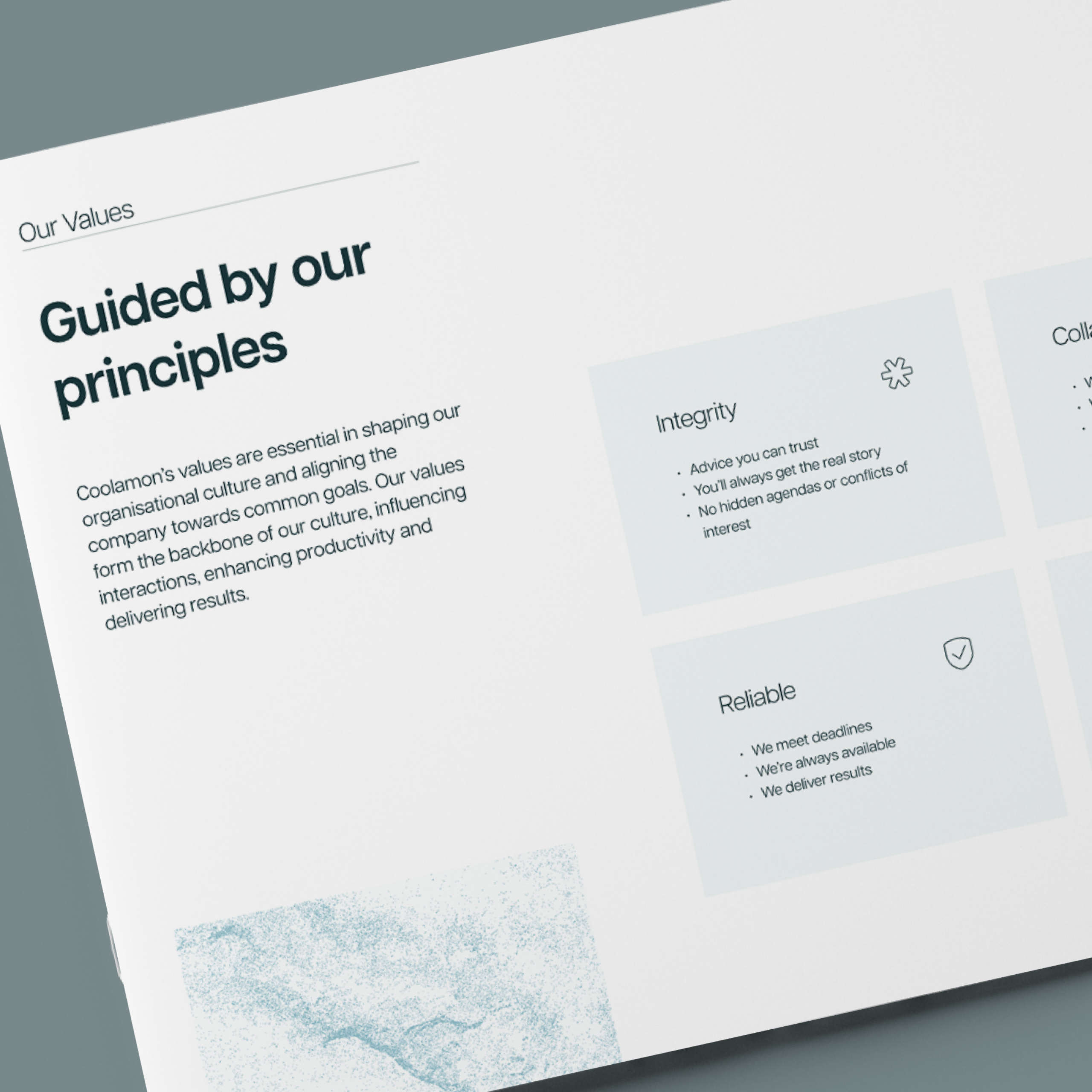
We often spruik about how creating a brand goes well beyond the logo, and luckily for us Sam and Bennett were fully onboard with making sure that each element of the brand was well crafted; going the extra mile to invest in great photography and premium document design that completes the overall brand feeling and ensures consistency across all their materials.


We used Ply for design, branding, templates and website and could not be happier with the results. Ply was professional, thorough and very accessible. As we launched a new business Ply provided us with a great springboard to take our first step and the market feedback has been very positive.

Sam Barrow
Founder & Director


Solid collaboration makes for great outcomes
It starts with trust
Like many of our clients, this was the first time Bennett and Sam had been involved directly in a branding project. Combine that with the fact that this was also the first time they were striking out on their own, and you've got some good reasons for apprehension when trusting an agency with something so important.
Through our deep dive at the start of the project and by clearly walking them through the process, we built the trust needed to take some risks and let us do what we do best.
The guys were super open to our ideas and as a result we were all stoked with the outcome.
Ditching what's safe to stand out
Building off the trust we had built, we were able to push the branding to be something more unique and interesting than what you'd typically find from strategic property advisors.
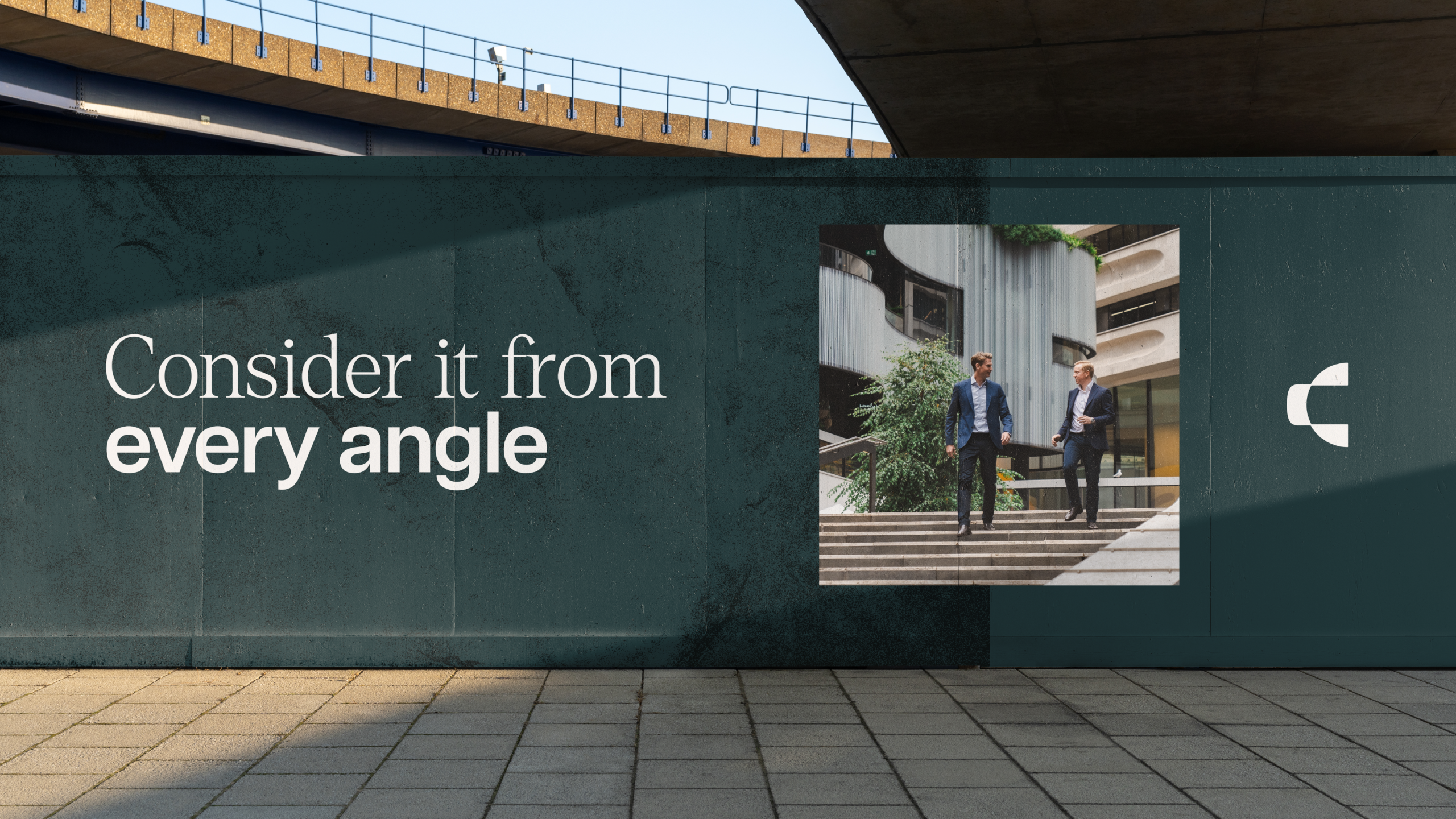
While we didn't get too radical - that wouldn't have been in line with the image we collectively wanted to convey - we were able to use custom graphical elements, a less traditional colour palette, relaxed photography and some bespoke layouts to set the brand apart in their industry while still conveying a strong sense of professionalism and trust.
Up Next
Makerops
A scalable brand system for the future of automation
